I wanted to understand why my tubes of Schmincke gouache behaved so oddly on a particular paper I’d been experimenting with in the studio — a sheet I had sized to a silky finish using a dilute animal glue sizing and a couple of coats of Chinese silk sericin mix (a workflow I’d been using to...
Jun 16, 2026
• by Éloïse Martin
Latest News from Sonriseartists Co
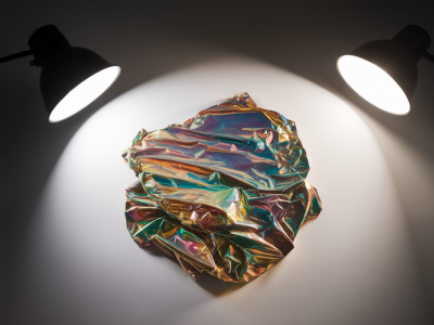
I spend a lot of time photographing test swatches, small paintings and pigment studies that contain metallic and iridescent particles. If you’ve tried this before you’ll know the problem: a beautiful shimmer in real life turns into a blown-out white hotspot in the photo, or the colour shift disappears entirely. Over the years I’ve developed a few reliable approaches using nothing more than...
Read more...
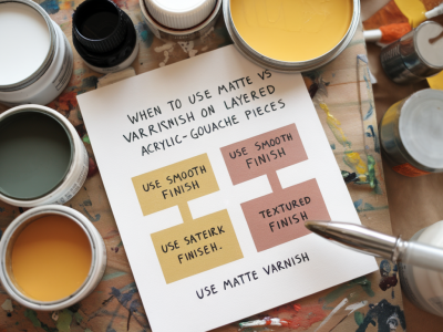
I often get asked during workshops: “Should I heat-set this layer or just let it air-dry?” It’s one of those deceptively simple questions that depends on the materials, the urgency of finishing, and how durable you want the work to be. Over years of studio experiments — and the odd panic with a bubbled collage — I’ve developed a risk-based framework I use to decide. Here’s how I...
Read more...
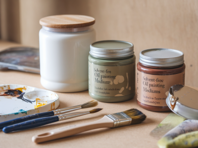
I recently switched the bulk of my underpainting work to Schmincke Horadam Gouache and ran a controlled studio test to see how it performs when layered for mixed-media pieces. I wanted to know whether that particular brand truly made a practical difference — not just in colour or finish, but in how it affects adhesion, reactivation, and the final visual depth when combined with acrylics, inks,...
Read more...
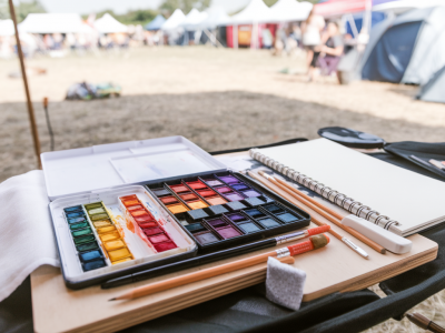
I take my mixed-media practice to festivals and outdoor events a lot — small commissions, quick commissions, live painting, or just sketching between talks. Over the years I’ve refined a kit that is compact, resilient and, crucially, forgiving of rain, mud, coffee spills and the odd bumpy ride on public transport. Below I’ll walk you through exactly what I pack, how I pack it, and the small...
Read more...
Water damage to a gouache painting can feel like a small disaster — colours that bled, paper cockled, edges that softened into a muddy haze. I’ve had my fair share of chilly mornings in the studio when a cup tipped, or a storage envelope let in damp during transport. Over time I’ve developed a practical, step-by-step approach that combines absorbent blotting, considered rehydration and the...
Read more...
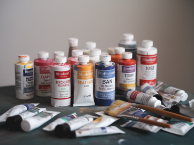
I remember the moment I debated swapping my familiar student tubes for a row of glossy pro bottles: standing in the art-supply shop, squeezing colour onto a scrap of primed board, watching how a cadmium-equivalent flattened out differently depending on which tube I’d purchased the week before. It felt like a small rite of passage — but also an investment decision. When, exactly, should a...
Read more...
I’ve been asked more times than I can count: “Can I swap synthetic brushes for natural-hair when working in gouache?” It’s a great question, especially as gouache sits somewhere between transparent watercolor and opaque acrylic in its behaviour. I decided to run a practical test in my studio to answer it properly — not just theoretical pros and cons, but how the brushes actually...
Read more...
I’ve spent years refining a compact mixed-media kit that fits comfortably under a café table, in a train seat pocket, or on my lap without turning a brief sketching session into a logistical puzzle. The trick isn’t just squeezing supplies into a small bag — it’s designing a system that protects fragile materials from spills, keeps inks and wet media tidy, and gives you enough variety to...
Read more...
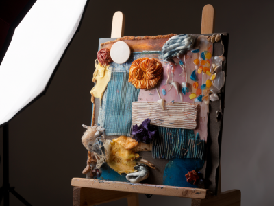
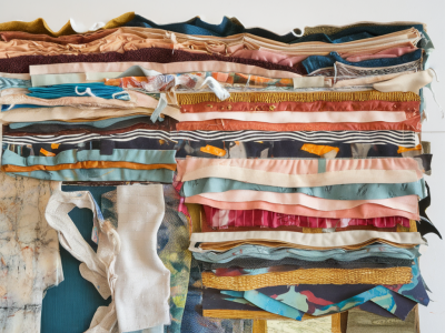
There’s nothing quite like the sinking feeling when you lift a flap of collage and find brittle, cracked layers beneath — torn paper revealing white gashes, flaking paint, or adhesive failures that threaten the whole piece. I’ve walked into my studio to find a finished panel with a cracked collage layer after a hot weekend, or spotted tiny fissures spread across a layered work made years...
Read more...
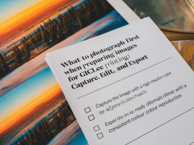
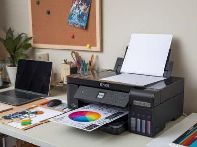
When I prepare images of my paintings and mixed-media pieces for giclée printing, I try to think like both the maker and the reproducer. I want the texture, colour relationships and subtle marks to survive the translation from studio surface to archival print. Over the years I’ve developed a practical checklist that starts in the studio and ends with an exported file that a print lab can...
Read more...