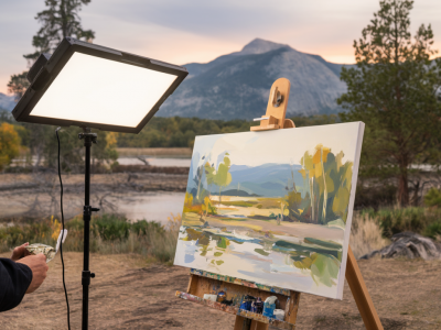
When I stand in front of a primed large canvas for the first time, there’s a small, familiar flinch — part excitement, part dread. Large formats ask for decisions that feel irrevocable: scale, focal point, and how marks will breathe across the surface. Over the years I’ve developed a set of quick compositional studies that act like a warm-up for the brain and body. They help me move past hesitation into playful experimentation, and they refine the choices I’ll make on the big piece. Here are five simple studies I use to build confidence when starting large canvases. Each one is short, tactile and designed to deliver useful information you can carry straight into the studio.
Why do quick compositional studies matter?
A quick study is not about producing a finished image. It’s about clarifying intention, testing relationships and learning what will or won’t read at scale. Working small and fast reduces the pressure to make everything “perfect” and encourages bold decisions. When I return to the large canvas I’ve already rehearsed the composition rhythm—where to place the big shapes, what value contrasts will work, and how the eye will move. Quick studies also save time: investing 20–40 minutes planning will prevent hours of indecision or repainting later.
Materials and setup
For these studies I usually work on A4–A3 paper or small boards. My favourites are cartridge paper for ink and marker exercises, and small gessoed panels for mixed-media trials. Useful materials:
- Big brushes (1" or larger) for bold strokes.
- Gouache or acrylic for opaque, fast-drying colour (I often use Winsor & Newton gouache or Golden heavy body acrylic).
- Ink and a loaded brush or dip pen for contrast and gesture.
- Masking tape or a paper mask to test edges and cropping.
- Compressed charcoal or soft pencils to map out values.
Keep a small timer or use your phone. Each study should feel like a sprint rather than a marathon—aim for clarity over detail.
Study 1 — Value lockdown (10–15 minutes)
Purpose: Quickly establish whether the main idea will read at scale by reducing the image to lights and darks.
How I do it: Working from thumbnail sketches or straight from a loose idea, I block in three values: dark, mid and light. I use diluted black ink or thinned acrylic to create the darks, a mid-grey wash for middle values, and leave the paper or panel as the light. No details — just large, flat shapes. I push the shapes around with a wide brush and occasionally lift out highlights with a rag.
What I learn: How the silhouette of the composition reads; whether my focal area has enough contrast; how negative space behaves. If the structure falls apart here, it’s a sign to rethink the core shapes before committing to a large canvas.
Study 2 — Gesture and flow (10 minutes)
Purpose: To map the visual movement and ensure the viewer’s eye travels in the way I want.
How I do it: I switch to charcoal or a large ink wash and make mark after mark, working quickly and without erasing. I exaggerate directional strokes—curves, diagonals, S-shaped flows—until a rhythm emerges. I often overlay simple arrow marks (drawn lightly) to confirm where the eye is led.
What I learn: Whether the composition feels static or dynamic; if I need to introduce a counterpoint to balance the movement; how to place a horizon or major axis to support the flow.
Study 3 — Palette restriction (20–30 minutes)
Purpose: To test a limited colour strategy that will unify a large surface and reduce the overwhelm of countless tubes.
How I do it: I pick two dominant colours plus a neutral (for instance, ultramarine, burnt sienna and titanium white). I force myself to mix everything from these three. Working on a small panel, I paint the composition broadly, focusing on temperature relationships and value rather than detail. If I want a pop colour, I add it sparingly at the end to see how it reads against the restrained palette.
What I learn: Whether the chosen combination creates enough depth and interest; which areas will need warm/cool shifts to sit correctly at scale; how limited palettes can simplify decisions and speed up painting on a large canvas.
Study 4 — Edge and focal testing (15–20 minutes)
Purpose: To figure out where to soften or harden edges so the focal point reads clearly across a distance.
How I do it: Using gouache or acrylic, I paint the composition but deliberately vary edge treatments. Some edges are butter-smooth and sharp; others are feathered with a damp brush or rag. I exaggerate: razor-sharp edge versus completely lost edge. I then squint and step back (even across the room) to see how the focal area holds. I sometimes label edges on the study—‘soft’, ‘hard’, ‘lost’—so I can replicate them on the big canvas.
What I learn: Which edges are critical for clarity, where to allow softness to create recession, and how texture around the focal area affects reading at distance.
Study 5 — Material play (20–30 minutes)
Purpose: To test surface and mark-making strategies that will be used on the large work—collage, scumbled layers, scraping or using unconventional tools.
How I do it: I create a small mixed-media panel where I experiment with layering: glue down scraps of paper or fabric, apply gesso and sand, use palette knife textures, or drip ink through a stencil. I note what tools create desirable textures—old credit cards, makeup sponges, or toothbrush splatter—and which approaches conflict with the composition.
What I learn: Practicalities of adhesion and layering at scale; how certain textures read from afar; which marks enhance the narrative and which distract.
Translating studies to the large canvas
Once I’ve completed the five studies I compare them. I often make a small table to summarise decisions before I begin. Here’s a simple example I keep beside the easel:
| Aspect | Decision |
|---|---|
| Dominant shape | Large left-hand mass, diagonal sweep to bottom-right |
| Value structure | High contrast at focal point; overall mid-tone ground |
| Palette | Ultramarine + Burnt Sienna + White (accent: Alizarin Crimson) |
| Edges | Sharp around focal details; soft transitions elsewhere |
| Surface | Collage underlayer + scraped acrylic passages |
That table isn’t a rulebook but a prompt to keep referring back to while painting. It’s surprisingly calming to have concrete notes when the canvas starts to demand decisions.
Practical tips to keep the studies effective
- Limit time. A strict 10–30 minute cap per study keeps the work decisive.
- Work slightly larger than thumbnails. A3 gives enough space to test relationships without becoming a full commitment.
- Keep materials minimal. Forced limitations incite creative solutions.
- Photograph each study. Viewing a flattened photo helps judge values and composition without being fooled by texture or wet sheen.
- Use masking tape to frame a “crop” that matches your final canvas proportions—this avoids surprises about scale and edges later.
These quick studies have become part of my ritual. They transform the intimidating blank into a staged set of possibilities. Often the studies themselves become source material—shapes, marks or colour mixes I reuse. If you haven’t tried this practice, pick one study and give it 20 minutes. You might be surprised at how much clearer your large-scale decisions feel afterwards.