I love experiments that sit between drawing and printmaking — processes that respond to touch, time and chance. Cyanotype is one of those magical techniques: simple to set up, fast to learn, and endlessly generous when combined with collage. Over the last few years I’ve been exploring small, hybrid prints that start with cyanotype exposures and are finished with collage, gouache, ink and hand-drawn elements. In this piece I’ll share a straightforward workflow you can try in a home studio, the materials I use, common questions and a few ideas to push the results toward illustration-led work.
Why cyanotype + collage?
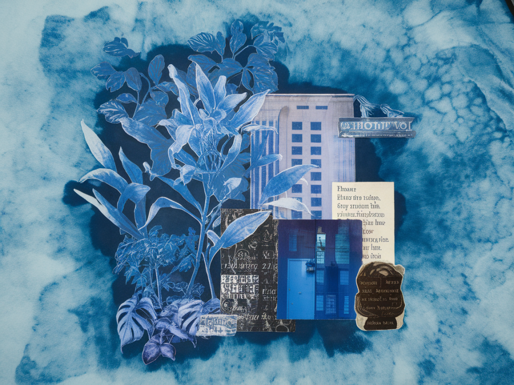
Cyanotype gives you a beautiful, moody blue base quickly — it’s forgiving, atmospheric and full of tonal range. Collage lets you add colour, texture and narrative without having to rely solely on the exposed image. Together they make hybrid prints that feel layered and painterly but retain the graphic qualities illustrators often love. For illustrators this combo is great because you can retain tight linework or bold shapes while enjoying the serendipity of photograms and textured surfaces.
Materials and basic setup
Here’s what I keep on hand for quick experiments. You don’t need pro equipment — I’ve used student-grade cyanotype kits just fine.
- Cyanotype kit or chemicals: Ferric ammonium citrate and potassium ferricyanide, pre-mixed solutions (I often use Sensitised Paper from Blue Sun or the Photogram DIY Kit from local suppliers).
- Papers: 300gsm cold-press watercolour paper, lightweight cartridge paper, Japanese washi (good for translucency) and ordinary photocopy paper for quick tests.
- Objects for photograms: leaves, string, stencils, lace, screenprint positives or cut-paper shapes.
- Glass or acrylic sheet: to hold objects flat on the sensitised paper during exposure.
- Light source: sunlight, a UV lamp (18W/9W fluorescent tubes work), or a UV LED exposure lamp for more control.
- Collage materials: coloured papers, hand-painted papers, scraps from magazines, tissue, tracing paper, printed linework.
- Adhesives and paints: PVA glue or a glue stick, acrylic medium, gouache, inks and fineliners for drawn details.
- Protective gear: gloves, apron and a dimly lit workspace to coat paper.
Simple step-by-step workflow
Below is a routine I use to make consistent small cyanotype-collage hybrids. It’s deliberately flexible so you can adapt based on the light source and your materials.
- Coat the paper: In dim light, apply the cyanotype solution evenly with a foam brush or soft brayer. I often double-coat for deeper blues. Lay the paper flat to dry — a few minutes in a cool, dark room or longer at ambient temperature.
- Arrange objects: Once dry, place the paper under glass, then arrange your photogram elements on top. For illustrative shapes I cut stencils from black paper and use those; for texture I use dried leaves or fabric.
- Expose: Expose in sunlight for 5–15 minutes depending on strength (less time in cloud cover), or use a UV lamp. The image will go a hazy green during exposure and then develop blue when rinsed.
- Rinse and dry: Rinse in running water until it clears; the deep blue will appear. Dry flat or hang. At this stage I often scan or photograph the print for reference.
- Plan the collage: Decide whether the cyanotype will be the background, a mid-layer or an accent. Cut collage pieces to echo shapes in the cyanotype or to introduce a contrasting motif — for example, bright paper shapes to suggest figures, or hand-painted patches to add warmth.
- Assemble: Adhere collage pieces with PVA or acrylic medium. Use a brayer to ensure flat adhesion. I leave some edges lifted or use translucent papers to reveal cyanotype beneath.
- Draw and finish: Add linework with fineliners, gouache details for highlights, or even graphite for subtle marks. Sometimes I reintroduce bleach sparingly to lift highlights from the cyan-blue.
Exposure guide
Exposure varies by light source, paper and coating thickness. Use the table below as a starting point for A4/300gsm-coated sheets.
| Light condition | Exposure time (approx.) | Notes |
|---|---|---|
| Bright, direct sun | 4–8 minutes | Shorter times for thin coatings; watch for hard-edged photograms |
| Overcast/cloudy | 10–20 minutes | Soft, subtle tonal range — good for layered effects |
| UV fluorescent lamp (18W) | 3–8 minutes | Consistent results; keep sheet flat under glass |
| UV LED exposure unit | 30–90 seconds (dependent on wattage) | Fast and repeatable but needs calibration |
Practical tips and troubleshooting
- Test strips save time: Always do a small test to check exposure. A narrow strip of paper can reveal how contrast and edge softness will look.
- Texture through translucency: Use mulberry paper or tracing paper as overlays in your photogram to create ghosted textures that read through later collage layers.
- Control vs chance: If you want more control, use cut-paper positives or hand-drawn acetate masks. For surprise, include organic objects — petals and leaves produce unpredictable veining.
- Colour options: Cyanotype is blue, but you can add colour in collage or overpaint with gouache and acrylic. I also like to print simple black linework on tracing paper and paste it over cyanotype to combine photographic and drawn languages.
- Preserving whites: If you want pure white areas, mask them before exposure with non-transparent paper or use white painted shapes adhered after rinsing.
- Flattening prints: Many cyanotypes curl when wet. Press them under boards with a blotter between sheets to flatten as they dry.
Compositional ideas for illustrators
Approach each hybrid as a small scene or emblem. Here are some prompts I use to kickstart a series of prints:
- Start with a central silhouette (figure or animal) in cyanotype, then use collage to create a narrative environment — patterned papers become clothing or foliage.
- Create repeating motifs: expose multiple small photograms with the same object but vary the collage elements to make a themed series.
- Contrast scales: combine large, soft cyan shapes with very small, cut-paper details to focus the eye.
- Use limited colour palettes in collage to keep the blue dominant but allow warm accents (ochre, coral) to pop.
Final practical notes
Keep a sketchbook of cyanotype tests: small squares with notes on exposure time, paper and object placement make it easier to reproduce effects later. If you plan to sell originals, consider fixing or varnishing collage areas to protect them, though be cautious with varnishes over cyanotype as some can alter the blue. For me, the joy is in embracing that balance of control and accident — the print gives me a mood, the collage gives me a voice.