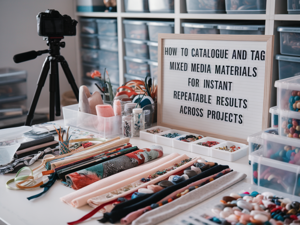
I keep a running inventory of everything I use in the studio — from the archival gesso I prefer for panels to the exact make of sumi ink I reach for when I want a fast, staining line. Over the years I developed a simple, repeatable system for cataloguing and tagging mixed-media materials that saves me time, reduces waste, and helps me recreate textures or colour interactions across different projects. Below I’ll walk you through the practical setup I use, with examples and templates you can adopt or adapt.
Why catalogue and tag materials?
When I first started experimenting with layered surfaces, I would make a piece I liked and then struggle to remember the sequence of grounds, mediums and marks that made it work. Cataloguing does three things for my practice:
Decide on a simple taxonomy
Choose a set of consistent tags you will actually use. Overcomplicated taxonomies become unused papers in a drawer. My top-level tags are practical and action-driven:
These tags let me search by outcome — for instance “staining + water-reactive + ink” finds the marks that will bleed into a wash versus sit on top.
What to record for each item
For each material I keep a short card (digital or physical) with the following fields. I use both a Google Sheet and physical swatch cards stuck onto a board above my desk.
| Field | Why it matters |
| Brand & product name | Exact reference for repurchasing and cross-checking MSDS. |
| Type / category | Quick filter: acrylic, oil, gouache, PVA, etc. |
| Batch / colour code | Helps for pigment variation between batches. |
| Behaviour tags | Staining, flex, soluble, etc — for performance searches. |
| Usage notes | How I typically use it: “thin with water for washes” or “apply heavy for impasto”. |
| Surface compatibility | Works on gessoed board, cotton rag paper, primed linen? |
| Image / swatch | Small photo and a painted swatch showing opacity and texture. |
| Mixes & recipes | Common mixes (e.g. “2:1 acrylic gel to ultramarine”) so results are repeatable. |
| Ageing notes | Yellowing or cracking observed over time. |
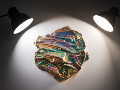
Make visual swatches non-negotiable
A written description is useful, but nothing replaces a visual swatch. I make a swatch card for every pigment, adhesive, ground and medium I buy:
When you’re searching for “transparent red wash over gesso” you’ll instantly see candidates and remember how they behaved.
Digital workflow: simple, searchable, shareable
I keep a Google Sheet that mirrors my physical cards and adds functionality:
You can export this sheet into a printable catalogue if you prefer a physical archive.
Tagging for process, not just product
I tag not only the products but the processes I use with them. Example tags I routinely add:
These process tags help me remember the gestures and timings that matter — not just the materials themselves.
Examples: How I document a mixed-media layer
Here’s one card example from a piece I returned to three times in a year:
Label storage for instant access
Storage is a big part of repeatability. I label containers with product name and the date opened. For mixed or custom recipes, I use small airtight jars with a printed sticker: recipe name, ratio, date created, expected shelf life. My labels include QR codes that point to the Google Sheet entry — a tiny QR-generator and label printer (Brother P-touch or Dymo) makes this quick to set up.
Testing protocols for critical interactions
When I plan a piece that relies on a specific interaction — say, wet-in-wet bleeding between ink and wash — I make a short test strip. Tests are short and consistent: same substrate, same humidity conditions if possible, same seeding (brush type, dilution). I keep the tests adjacent to the swatch cards with a note “Pass” or “Fail” and what to tweak.
Share and collaborate
If you teach or collaborate, a tidy, shared catalogue is a gift. I export a pared back version of my sheet as a PDF for workshop handouts — students love having a “cheat-sheet” of materials with quick tags that relate to exercises. When working with a framer or conservationist, I’ll hand over the product list and ageing notes so they understand long-term behaviour.
Maintain it — 15 minutes a week
The biggest barrier to any system is inertia. I set aside a 15-minute slot every Sunday to add new purchases, photograph used tubes, and tick off materials I’ve run out of. Small, regular updates keep the catalogue useful and prevent the pile-up that kills so many good intentions.
Once you have a simple tag set, visual swatches, and a short testing protocol, your studio becomes a reproducible lab. You’ll waste less time guessing, spend more time making, and find that the surprising effects you love can be summoned again — reliably — whenever you need them.