I often get asked whether the finish you choose for a piece — glossy, satin or matte — actually changes the perceived depth and vibrancy of colour, especially in mixed-media work where papers, inks, gouache and acrylic interact in unpredictable ways. To answer that, I ran a simple, practical test with three widely used archival varnishes and documented how each affected colour depth, texture and handling. I want to share the set-up, what I observed and a few takeaways you can use in your own studio experiments.
Why this test matters for mixed-media
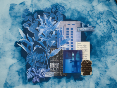
Mixed-media pieces are layered beasts: an underlayer of acrylic, a patch of collage, gouache or watercolour washes, and maybe ink linework on top. Those different materials reflect and absorb light differently, and a varnish will change how light bounces off the surface — which influences whether colours feel flat or saturated, how texture reads, and whether tonal transitions remain legible.
I was aiming for a practical comparison rather than a lab-controlled analysis. The goal was to see, in the context of my working practice, whether an archival varnish could noticeably enhance or reduce colour depth, and what trade-offs (texture, sheen, reversibility) would matter most for everyday studio decisions.
Materials and samples
I made six small test panels (15 x 20 cm) using heavyweight watercolour paper mounted on hardboard. Each panel contained the same elements, applied in the same order:
After allowing everything to dry and rest for 48 hours, I applied three different varnishes to separate sections of the same panel so I could compare their effects side-by-side. The three varnishes were:
I also left one strip of the panel unvarnished as a control so I could judge the baseline colour depth and texture of the paper and media combination.
Application method
To keep variables low, I applied each varnish with a soft, wide synthetic brush across distinct vertical strips approximately 4 cm wide. I followed manufacturers’ instructions for thinning (none needed), brushing technique (long, even strokes), and drying times. Ambient conditions were consistent (studio at 20–22°C, low humidity).
What I measured
My observations focused on practical, visual qualities:
| Varnish | Gloss Level | Perceived Colour Depth | Texture Visibility | Notes (application & handling) |
|---|---|---|---|---|
| Unvarnished (control) | Matte | Baseline — slightly muted | High (paper tooth visible) | Soft, tactile surface; colours appear airy but not saturated |
| Golden MSA (Gloss) | High gloss | Noticeably deeper and more saturated | Reduced — smoother appearance | Even, non-cloudy finish; brushwork leveled out; removable with mineral spirits |
| Winsor & Newton Resin (Gloss) | High gloss | Deeper saturation, slightly warmer cast | Reduced but depth of darks pronounced | Very glossy; slight surface tension created pooling near collage edges |
| Gamblin Gamvar (Gloss) | Medium-high gloss | Vivid, clean saturation without significant warmth | Moderately reduced; textures readable | Quick drying; flexible film; removable with mineral spirits |
Observations — how finish affected colour depth
All three varnishes increased perceived colour depth compared with the unvarnished control. The gloss finish allows more specular reflection, which increases contrast between lit and shaded areas and makes pigments feel richer. However, each varnish had its character:
In short: gloss generally deepened colour, but the degree and character of that deepening varied. If you want the truest saturation without colour shift, Gamvar was my favourite in this set. If you want maximum richness and a very smooth finish, Golden MSA wins. If you want a shiny, slightly warm finish (useful for some oil-like surfaces) the Winsor & Newton resin provides that look.
Texture and legibility of mixed-media marks
One thing I noticed clearly: highly reflective gloss can obscure matte media when viewed from oblique angles. My delicate ink linework and soft charcoal washes read best under Gamvar and the unvarnished area; under the high-gloss Golden MSA and resin the deepest blacks sat beautifully, but thin lines occasionally “disappeared” beneath specular highlights.
If your practice relies on subtle ink marks or textured collage edges, a satin or matte varnish (not tested here) might preserve those qualities better. Gloss will smooth and visually “unify” disparate materials — great for colour richness, less helpful for preserving micro-details.
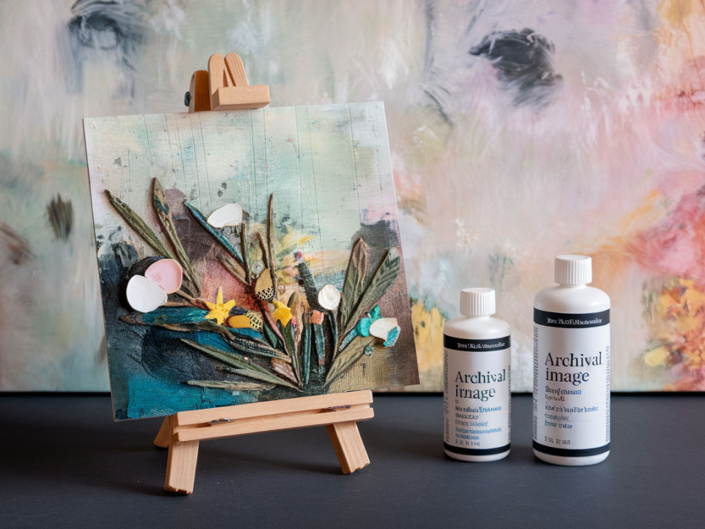
Handling, removability and archival concerns
All three varnishes I used are formulated for permanence and removability; both Golden MSA and Gamvar are designed to be removed with solvents like mineral spirits if necessary. The Winsor & Newton resin is also removable but required slightly more care during application to avoid pooling.
Short-term yellowing was minimal across all three after three weeks in indirect daylight. Long-term yellowing is harder to judge in a quick test, but choosing a varnish specifically marketed as non-yellowing (check manufacturers’ technical data sheets) is sensible for archival work. UV protection additives can help preserve pigment integrity, especially for delicate water-soluble media and printed papers.
Practical suggestions for your own experiments
I’ll be continuing to test satin and matte versions next, and I’ll also try a long-term ageing strip in UV exposure to note yellowing and brittleness over time. If you have specific varnishes you’d like me to add to the comparison (or a particular mixed-media combination you’re worried about), tell me in the comments and I’ll include them in the next round of tests.