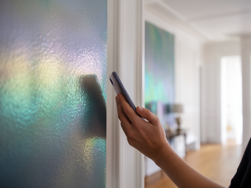
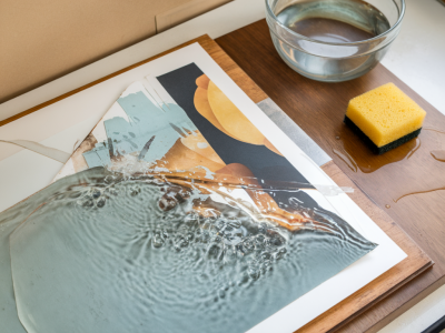
I spent a rainy afternoon last week photographing a new series that uses iridescent powders and interference pigments layered across gouache and collage. The shimmer was beautiful in person, but on my phone screen the highlights turned into blown-out white patches that flattened all the colour shift I’d worked for. After a few rounds of trial and error with LED panels, diffusers and phone camera settings, I settled on a workflow that reliably captures the complex colour play without blowing out the pearlescent areas. Below I share the exact handheld lighting setups and phone-camera “hacks” I now use when shooting iridescent pigments in the studio or on site.
Why iridescent pigments blow out (and what to control)
Iridescent and interference pigments reflect light differently than normal pigments: they rely on thin-film interference or microscopic platelets that reflect light at varying angles and wavelengths. That means:
The highlight regions can be extremely specular (mirror-like), so a single bright reflection from a light source will clip to white.Colour shifts depend on viewing and lighting angles — change those and you change the hue entirely.So to photograph them well you need to control three things: light intensity, light quality (hard vs soft), and viewing/lighting angle. Then tweak the phone camera settings to preserve highlight detail and capture the colour shift.
Choose the right portable LED panel
Not all LED panels are equal. For iridescent work I look for three features: dimmability, adjustable colour temperature, and the ability to add diffusion or modifiers easily. Aputure Amaran and Lume Cube panels are workhorses I often reach for — they’re compact, have stepless dimming, and you can add diffusers or gels.
Dimmability: It’s vital. Rather than blasting the pigment with brightness and letting the camera compensate (which often clips highlights), I lower the panel until the specular reflections sit within the camera’s dynamic range.Colour temperature control: Interference pigments shift with different light spectra. A neutral daylight (around 5000–5600K) is a good starting point, but sometimes a warmer or cooler temperature reveals better colour shift—so I test and leave the panel adjustable.CRI/TLCI: A high CRI (90+) gives more accurate colour rendering. Cheap panels with low CRI can change hue and make the shift look muddy.Shape and soften the light
Hard, bare panels create small, bright specular reflections that blow out. Softening and expanding the light source reduces the brightness of any single reflected hotspot.
Use a small diffusion panel or a softbox attachment — for Aputure Amaran I use a small foldable softbox. For Lume Cube I use the provided diffuser cap plus a layer of tracing paper or a disposable paper lantern if working on location.Add a second, fill panel at lower intensity to lift shadow detail without creating new specular hotspots.Try cross-lighting at low power: two diffused panels from opposite sides, both dimmed, often reveals more of the iridescent sheen without a single overwhelming reflection.Angle the light (and the phone)
Because iridescence is angle-dependent, small changes in angle make huge differences. I use this deliberately:
Start with the light at a low grazing angle across the surface — that often emphasises the shift without resulting in a direct hotspot.Move the light off the camera axis. If the light source is in line with the phone lens, you’ll usually get mirror-like blowouts. A 20–45° offset between light and lens often preserves the highlights.Tilt the artwork or the phone incrementally and watch how the colour moves — take multiple frames at slightly different angles to pick the best one later.Phone camera settings and hacks
Modern phones are powerful, but their default auto modes try to “average” the scene and may clip highlights. Here’s what I change.
Use a manual or pro mode: Lock exposure (EV), ISO and focus. Lower ISO to the base (usually 50–100) to reduce noise and increase dynamic range.Exposure compensation: Dial negative exposure compensation (-0.5 to -2 stops) to protect highlights. If the image looks darker overall, recover midtones later in RAW or in editing.Lock focus and exposure separately: Tap to focus, then slide the exposure down. On iPhones you can lock AE/AF; on Android use Pro mode or Camera FV-5 to decouple them.Shoot RAW (DNG) if available: RAW retains highlight detail and colour information that compressed JPEGS discard. Even if you keep a quick jpeg, having a RAW file gives you more rescue room in post.Avoid HDR unless careful: HDR can help retain highlights but often smears micro-contrast and specular colour shifts — test it. Manual bracketing can be better.Bracket exposures: Take a -1 and -2 stop frame in addition to the normal exposure. Later you can choose the frame that best preserves the iridescent detail or composite exposures in editing software.Use a polarising filter attachment: Small clip-on circular polarizers (like Moment or Sandmarc lens attachments) help reduce unwanted glare. Note: polarizers can also kill the sheen entirely if rotated too far, so keep them adjustable and test while rotating.Lock white balance: Auto white balance may shift between frames. Set a Kelvin value (5000–5600K for daylight) or use a grey card reference and lock WB.Practical step-by-step workflow I use in the studio
| Step | Action |
|---|
| 1 | Set up two small LED panels (Aputure Amaran 100d or Lume Cube Panel) with diffusers at low power, angled 30–45° off-axis. |
| 2 | Mount phone on a small tripod or handheld rig; open Pro/Manual mode; set ISO 50–100, shutter speed 1/60–1/200 (adjust for brightness), lock focus and WB to 5200K. |
| 3 | Tap to expose, then dial exposure compensation down by ~1 stop. Take a shot. Take additional frames at -1 and -2 stops. |
| 4 | Attach a circular polariser and rotate slowly while shooting to reduce hotspots but keep pigment shimmer. If polariser kills the effect, remove it and rely on diffusion/dimming. |
| 5 | Review RAW frames; pick the shot that preserves colour shift and highlight detail. If needed, combine bracketed shots in Lightroom or Photoshop. |
Post-processing tips
In Lightroom or mobile RAW apps I:
Lower Highlights and Whites carefully to recover specular detail.Raise Shadows and adjust Exposure moderately if the negative exposure made the midtones too dark.Boost Vibrance rather than Saturation to preserve natural skin/ground tones if your artwork includes them.Use selective adjustments to bring up detail in the pearlescent areas without changing surrounding matt surfaces.Small kit suggestions for portable shoots
If you want a compact kit I often take into the field:
Aputure Amaran ML series or Lume Cube Panel (with diffusion caps)Foldable softbox or a couple of diffusion sheets/tracing paperMoment or Sandmarc clip-on circular polariserSmall phone tripod or handheld rigGray card and a small notebook to record panel settingsPhotographing iridescent pigments is part technical, part choreography: nudging lights, tweaking phone settings and moving the camera a centimetre at a time until the colour shift sings without turning into a white blotch. With a dimmable, diffused LED source, careful angle control, and RAW/bracketing strategies on your phone you’ll get much closer to what your eyes see — and sometimes even find new aspects of the finish that surprise you.