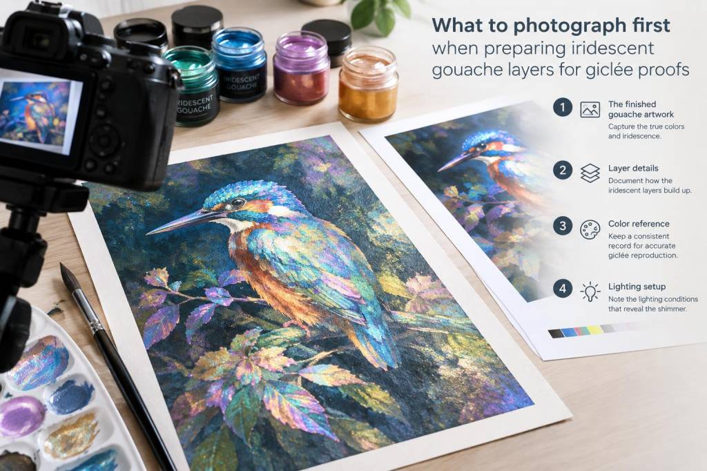
I often think of iridescent gouache as a material that lives in two worlds: the pigment is at once paint and light, and that makes photographing it for giclée proofs a small act of translation. When I prepare work for reproduction I want the print to carry not just colour but a sense of depth, texture and the way light moves across layered surfaces. Over the years I’ve developed a routine — a set of images to shoot first — that helps me capture everything a lab will need to make convincing giclée proofs.
Why sequence matters
Photographing in a considered sequence saves time and prevents missed information. Iridescent and pearlescent paints change with viewing angle and lighting, so one single image rarely contains all the data you need. My first shots are always the ones that capture consistent, reproducible information (flat colour and tone), followed by the more directional, variable shots (angle-dependent sheen, texture). That order makes it easier to build soft-proof workflows and to communicate with the printer.
Essential shots to make first
When I strip back the process to essentials, this is the shot list I follow at the start of a repro session. Photograph these first, in this order, before you experiment with more artistic lighting.
- Flat, evenly-lit copy (orthographic) — This is the baseline: a perfectly even, frontal, diffuse-lit photo or flat-bed scan if your piece is small enough. It records the accurate colour and tonal relationships of underlying paint layers without directional sheen confusing the sensor.
- Texture/relief capture — A raking light shot at a low angle to reveal surface texture, brushwork and impasto. This helps a printer understand how much surface relief will catch highlights and can inform varnish choices or ink layering strategies.
- Specular reference (sheen highlight) — A controlled shot that isolates the iridescent sheen: a bright, small light source placed at an angle that produces a catchlight on the iridescent areas. This documents where the paint exhibits directional reflection.
- Angle variation series — A set of three to five shots taken at small incremental angles (10–30°) left/right/up/down from the frontal view. These capture the colour shift of mica or interference pigments and are invaluable when printers try to simulate iridescence with printing techniques.
- Cross-polarised capture (if possible) — A shot that reduces specular glare using polarising filters on both light and lens; useful to separate true colour/opacity from surface reflection.
- Close-ups of problematic/important areas — Macro images of delicate transitions, edge work, collage seams, or areas with heavy pearlescent load so nothing is left to guesswork.
Practical lighting and camera set-up
I use a DSLR or mirrorless with RAW capture and a sturdy tripod. For lighting I favour continuous LED panels with softboxes for the flat copy, and smaller directional lights (or a bare LED wand) for specular references and raking light. Here are the basics:
- Flat copy: Two softboxes at 45° to the artwork, camera perpendicular to the plane. Use a grey card and include it in the frame for white balance.
- Texture/raking light: Single light low and parallel to the surface at 10–20° to emphasise relief.
- Specular highlight: Small, bright point-source placed off-axis so it creates a distinct highlight but doesn’t blow out surrounding tones.
- Cross-polarisation: Circular polariser on the lens and linear polariser sheets on the light sources rotated to extinguish glare.
| Shot type | Typical settings |
|---|---|
| Flat copy | RAW, base ISO (100–200), f/8–f/11, shutter to expose correctly, tripod, white-balance with grey card |
| Raking light | ISO 100–400, f/8–f/16 for depth, adjust shutter to keep highlight detail |
| Specular highlight | Lower aperture to control highlight shape (f/4–f/8), watch for clipped speculars, bracket exposures |
Why I photograph the flat copy first
Starting with a flat, evenly-lit photograph gives you a consistent colour/tone file to work from. Iridescent paints often look flatter under diffuse light, but that flat image is the reference for values and colour relationships. It’s what I use for initial soft proofs and what the lab will want for matching neutrals, shadows and midtones.
Documenting the iridescence — what to capture
Irisdescence is an effect, not a solid colour. To convey it you need:
- A record of the angles at which the effect becomes visible (angle shots).
- A record of the intensity of the sheen (specular reference).
- A record of how the sheen interacts with the pigment beneath (flat copy + close-ups).
When I send files to a lab I include at least one image with the specular highlight visible and a short text note: where did I stand, where was the light, what should they try in proofs? Clear communication helps labs choose varnish, ink layering or pearlescent varnish simulation strategies.
File handling, colour management and notes for the lab
Shoot RAW and keep your flat copy in a linear, uncompressed workflow until you’ve soft‑proofed. I use Adobe RGB or ProPhoto RGB for working files (depending on the lab’s preferences) and convert final TIFFs to the printer’s ICC profile. Always include:
- RAW + TIFF exports at native resolution (unflattened if you’ve layered scans).
- Colour reference: included grey card and a small shot of the piece next to a printer’s profile patch if you can.
- Metadata text file: list of paints (brand and finish — e.g. Schmincke Iridescent White, Winsor & Newton gouache), varnishes, paper or support, and lighting used for specular shots.
Communicating about iridescence with your printer
I always attach a short, practical brief: which image is the reference (flat copy), which image shows the sheen (specular), and which shows the texture (raking light). If you want the final print to attempt an iridescent effect, suggest options: pearlescent inks, spot varnish, or metallic overprint. Labs may also propose layered varnish or specialty substrates; having the angle series helps them judge how extreme the effect is and whether a printed simulation will be convincing.
Quick checklist I follow before packing files off
- Flat copy with grey card and RAW file saved.
- Raking light and specular highlight images saved and labelled.
- Angle variation series (3–5 frames) saved.
- Close-ups of tricky areas.
- Colour profile and metadata exported as requested by the printer.
- Short notes for the lab about desired sheen and possible print techniques.
Photographing iridescent gouache for giclée proofs is as much about creating a clear, reproducible record as it is about capturing the magic. If you prioritise the flat, consistent data first, then add controlled, descriptive images of sheen and texture, you give the printer the best chance to reproduce the work faithfully — or to advise you on creative printing solutions that honour the material’s iridescent life.