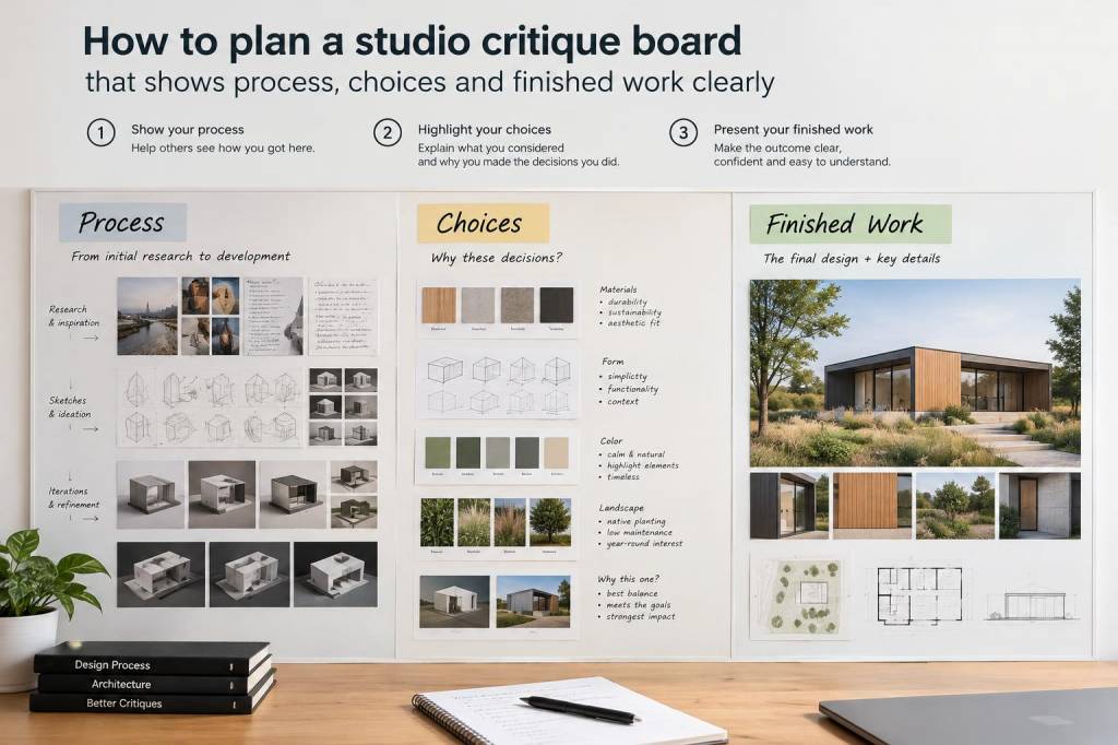
I have always found that a strong critique board does more than display images. It shapes a conversation. It lets me see a body of work as a sequence of decisions rather than a pile of isolated pieces, and it helps other people read what is happening in my process without having to guess. When I plan a studio critique board, I want it to do three things at once: show where an idea began, reveal the choices that changed it, and let finished work stand with confidence.
That sounds simple, but in practice it takes care. A board that is too tidy can hide useful uncertainty, while a board that is too crowded can make every image feel equally important. I have learned to treat the board as an edited argument. Every object on it needs a reason to be there. If I cannot explain why a sketch, sample, revision, or final piece belongs, it probably does not belong.
Start with a clear question
Before I pin up a single image, I ask myself what I want feedback on. Am I testing composition, colour, scale, surface, or narrative? Am I showing a project from first idea to final outcome, or am I asking viewers to compare several possible directions? The answer changes everything, because a critique board is not just a display surface. It is a working tool.
For example, if I want comments on mark-making, I will include pages of early doodles, small material tests, and close-up details of paint handling. If I want feedback on sequence, I will place studies beside later versions so people can see how one choice led to another. If I am preparing a board for a group critique, I think about what a viewer needs in order to understand my aim in under a minute. That often means making the central question very visible, even if I never write it down.
I also like to decide whether I want the board to feel open or resolved. An open board invites discussion and uncertainty. A resolved board supports a more finished presentation. Both can work, but mixing them without intention usually weakens the whole structure.
Choose a narrative structure
My favourite boards read like a visual story. I usually build them from left to right, or from top to bottom, so the viewer can follow a clear path. That path might begin with raw observation, move through experiments, and end with selected outcomes. I do not need every stage to be represented equally. What matters is that the movement feels intelligible.
When I am mapping a board, I often think in three sections:
- Origin: sketches, references, notes, found images, or observational studies
- Development: tests, revisions, colour studies, failed attempts, and material experiments
- Resolution: finished work, near-final pieces, or selected details that show what stayed and what changed
This structure helps me avoid the trap of presenting only polished work. Process matters because it shows judgment. A viewer can see not only what I made, but also what I rejected and why. That information often tells a richer story than the final image alone.
Sometimes I break this structure on purpose. If I am showing a project where ideas loop back and forth, I may place a finished piece beside an early test so the relationship becomes visible immediately. That kind of contrast can be powerful, especially when the work has developed through repeated return rather than a straight line.
Select material with restraint
I used to think a critique board needed to show everything. Now I know that excess can blur meaning. I try to choose material that earns its place. A single strong sketch can communicate more than five similar drawings. One carefully chosen failed sample can say more about a problem than a whole stack of near-identical tests.
My selection process usually begins with a spread of options on the studio floor. I group pieces by theme, surface, colour, or stage of development, then I remove anything that repeats the same information. I ask myself: does this item reveal a decision, a shift, or a discovery? If not, I leave it out.
I also pay attention to scale. Large pieces can dominate a board, so I balance them with smaller supporting material. A tiny colour swatch can suddenly make a large painting feel legible if it explains a palette choice. A cropped detail can draw attention to a surface that would otherwise be missed. I like that tension between overview and close reading.
Show choices, not just outcomes
One of the most useful things I have learned is that people respond well when they can see the logic behind a work. They do not need every thought I had, but they do need enough evidence to understand why I moved in a certain direction. That is why I include choices as visible objects.
A choice might be a shift in colour temperature, a change in paper weight, a test of transparency, or a different way of cropping an image. I make those decisions legible by placing alternatives side by side. I may pin two versions of the same composition next to each other, or place paint samples beside the finished surface so the relationship becomes obvious.
I also use annotations sparingly. I am not trying to write an essay on the wall. A short note can be enough: a colour name, a material combination, a question mark, a date, or a brief remark about what changed. I like when the board sounds like studio language rather than polished presentation. It feels honest and useful.
| Board element | What it reveals | What I avoid |
|---|---|---|
| Early sketch | Initial idea, composition, first instinct | Too many similar drawings |
| Material test | Surface response, colour behaviour, tool marks | Samples with no clear link to the project |
| Revision | Problem solving and decision making | Including every minor adjustment |
| Finished work | Resolved direction and visual impact | Hiding earlier stages behind it |
Build visual rhythm
A board needs rhythm as much as it needs content. If every item is spaced too evenly, the result can feel static. If everything is clustered, nothing gets room to breathe. I usually start by placing the largest or most important work first, then I build outward around it with supporting images.
I like to alternate dense areas with open space. That negative space gives the eye a place to rest and helps each item feel intentional. It also stops the board from becoming a wall of evidence. I want people to move across it, not simply scan it.
Colour is another part of rhythm. Even when I am working in a limited palette, I try to repeat tones in a deliberate way so the board feels connected. A warm test can echo a warm passage in a finished piece. A cool study can create a visual pause. If I have one very strong accent colour, I often use it once or twice more, not to repeat myself, but to create continuity.
I also think about texture. Rough notes, glossy prints, matte paper, taped edges, and cut paper fragments all change the reading of a board. If every item has the same surface, the result can feel flat. Variety in material helps process feel alive.
Make finished work earn its place
Finished work should not simply sit at the end of the board as a reward. It needs to interact with the material around it. I like to place final pieces close enough to their earlier stages that a viewer can compare them quickly. That comparison is where meaning often appears.
At times I include only one finished piece, even if there are several. That single work can act as a focal point and prevent the board from becoming overloaded. Other times I show a small series so the viewer can see variation within a shared approach. In either case, I make sure the final work is not isolated from the process that shaped it.
If a finished piece has changed a great deal from its early version, I show that transformation clearly. If it has barely changed, I show that too. Both stories are useful. A critique board becomes much stronger when it acknowledges that continuity can be as interesting as change.
Plan for conversation, not performance
I used to arrange boards as if they had to impress people immediately. Now I think of them as conversational surfaces. That shift changed everything. A good critique board should make it easy for someone to ask a useful question, notice a pattern, or point out a contradiction I have missed.
For that reason, I leave a little room for dialogue. I do not pack the board so tightly that it feels final and untouchable. I allow some gaps, some uncertainty, and some obvious points of tension. Those spaces invite response. They also make it easier for me to adjust the board during critique if a new direction emerges.
When I know I will be speaking about the work, I stand back and rehearse the path I want to take through it. I ask myself what I would say first, what I would want to explain next, and where I would invite questions. That rehearsal helps me see whether the board supports my explanation or fights against it.
Over time, I have realised that a strong critique board is less about perfection than about readability. It should let process remain visible, choices remain traceable, and finished work remain powerful. When I get that balance right, I feel more confident in the studio, because I can see not only what I have made, but also how I arrived there and where I might go next.