Techniques

When to use matte vs satin varnish on layered acrylic–gouache pieces: a decision flowchart for colour and texture

When to use matte vs satin varnish on layered acrylic–gouache pieces: a decision flowchart for colour and texture

I often get asked whether to use a matte or satin varnish on mixed media pieces that combine acrylic and gouache. It’s a deceptively simple question—one that opens into considerations of colour depth, surface texture, light behaviour, and practical protection. Over time I’ve developed a little decision flowchart in my head (and on scraps of paper in the studio) that helps me choose the right finish for each work. Below I’ll walk you through the reasoning, share practical tips, and suggest specific products I trust.

Why finish matters on acrylic–gouache layers

Varnish does more than just protect. On layered pieces that mix acrylic (usually glossy or satin by nature) and gouache (matte and delicate), the varnish you choose will:

  • Shift colour saturation—a satin varnish typically deepens and enriches colours more than a matte.
  • Change perceived texture—matte softens surface reflections and can hide brushwork highlights; satin reveals more depth and sheen.
  • Affect viewing conditions—satin catches light and can enhance detail, but may produce glare under bright lights; matte is more forgiving in varied lighting.
  • All these effects are doubled on layered work, because one layer’s sheen interacts with another. The practical result? The same piece can look quite different under a matte versus a satin finish.

    Key questions I ask before varnishing

    Before I choose, I answer a few quick questions about the work. You can use these too:

  • Do I want colours to pop? If yes, lean satin. If you prefer a softer, more muted palette, choose matte.
  • Is surface detail important? Satin preserves micro-texture and highlights; matte dampens glare and may obscure tiny textures.
  • Will the piece be displayed under gallery lights? Matte is kinder under strong directional lighting; satin can sparkle but also produce hotspots.
  • How important is conservation/protection? Both finishes can protect, but your choice may influence how often you need to retouch or recoat.
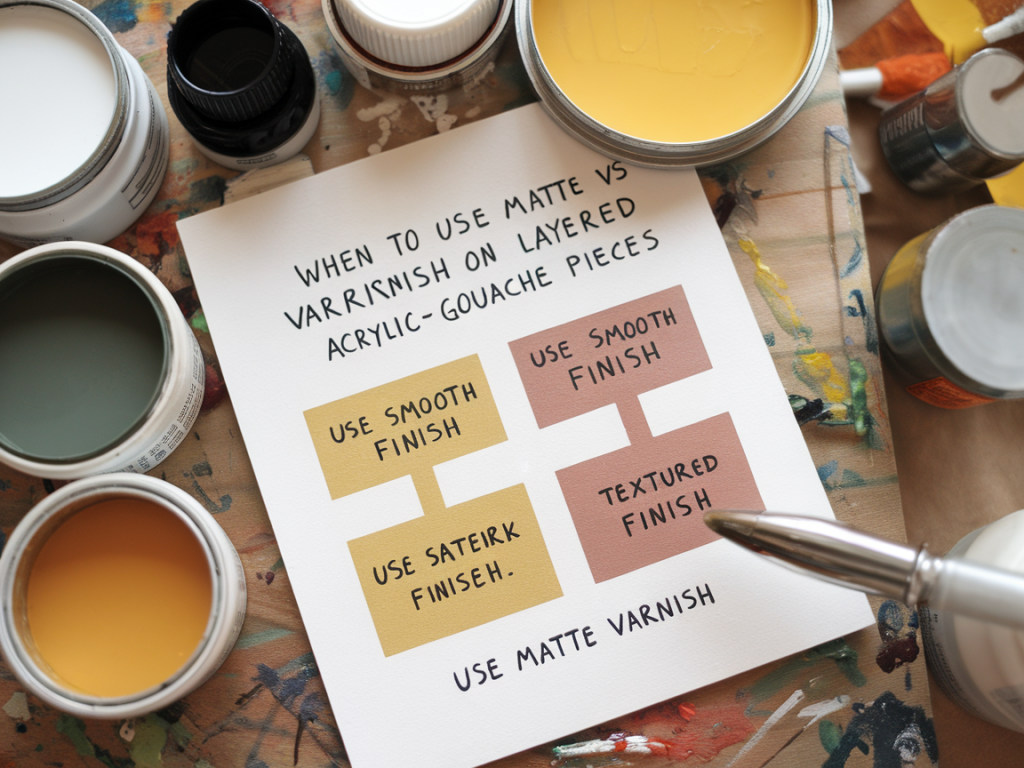
  • Decision flowchart — a practical guide

    Here’s the flow I follow. You can test each step in small strips or on varnish swatches beside the painting.

    StepPromptAction
    1Is varnish primarily for protection (e.g. for shipping/exposure)?If yes: choose a conservation-grade varnish (e.g. Golden Polymer Varnish, Grumbacher). Decide finish based on steps below.
    2Do I need colours to appear more saturated?If yes: lean towards satin. If unsure: test both on a scrap.
    3Is surface texture/brushwork an important feature?If texture is important: choose satin (it emphasises texture). If texture should recede: choose matte.
    4Will piece be displayed in bright, directional light?If yes: prefer matte to avoid glare. If in soft ambient light: satin can be beautiful.
    5Do I want a compromise?Choose eggshell or low-sheen satin to balance reflection and colour depth.

    Practical testing — how I experiment before committing

    I never varnish a whole piece without testing first. Here’s the ritual I follow so I can be confident in the outcome:

  • Make a swatch with the same materials layered in the same order as the artwork.
  • Allow the swatch to fully cure—especially important for acrylic layers. I usually wait a week for thick acrylic films; gouache needs to be bone-dry and stable.
  • Try small patches of matte, satin and gloss varnish. Observe in different lights (window light, lamp, gallery bulb).
  • Photograph the swatches. Photos often reveal how varnish will behave under camera lenses or online reproduction.
  • Surface concerns with gouache and acrylic

    Gouache is notoriously sensitive to moisture. If your gouache layer is fully gouache without any acrylic barrier, be cautious with solvent-based or waterborne varnishes that might re-wet or lift pigments. In my practice I usually:

  • Seal gouache with a thin layer of acrylic medium if the gouache is intended to be overpainted or protected. A diluted acrylic medium (e.g. Golden Acrylic Medium, 1:1 with water) can form a barrier—test first.
  • Use a spray fixative as an initial protective layer for sensitive gouache areas. Brands like Winsor & Newton or Daler-Rowney produce workable fixatives. Spray cautiously and test for any darkening.
  • Apply varnish only when all layers are fully cured and sealed. If you're unsure, a conservator’s adhesive-resin-based isolation layer might be worth the investment for valuable pieces.
  • Product suggestions and application tips

    Two varnishes I reach for are:

  • Golden Polymer Varnish (Satin) — water-based, durable, and available in matte, satin and gloss. It gives a rich, slightly deepened colour without being shiny.
  • Grumbacher Picture Varnish (Matte) — a good, economical water-based matte option that tends not to over-powder the surface.
  • Application tips I follow:

  • Use a wide, soft varnish brush for self-leveling and minimal brush marks.
  • Apply thin, even coats. Two thin coats are better than one heavy coat.
  • Allow adequate drying time between coats—follow the manufacturer’s guidance but add extra hours in high humidity.
  • For spray varnishes, hold the can at recommended distance and use smooth passes to avoid pooling.
  • When I choose a mixed finish

    Sometimes the answer isn’t purely matte or satin. I’ve used mixed finishes strategically: satin on focal areas to intensify colour and matte on surrounding zones to keep the eye centred. This requires masking or selective application, but done carefully it can be a powerful tool to direct attention without altering the work’s integrity.

    Final practical note

    Varnishing layered acrylic–gouache work is always a balancing act between aesthetics and protection. If you’re unsure, make samples, live with them for a few days, and view them in the conditions where the piece will be displayed. That small rehearsal will save you from surprises and help you choose a finish that supports the story you want the painting to tell.

    You should also check the following news:

    How to build a repeatable giclée proofing workflow at home using an epson printer and printable colour targets

    How to build a repeatable giclée proofing workflow at home using an epson printer and printable colour targets

    I make prints at home quite often — not just for editions but to proof files before sending work...

    May 03