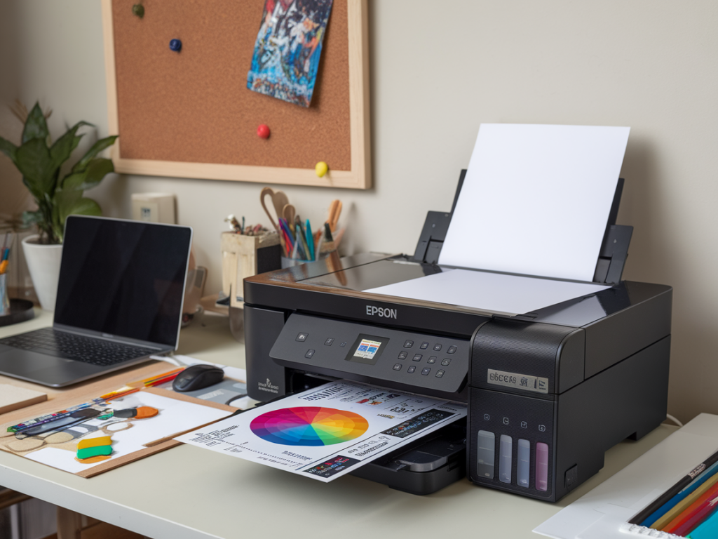
I make prints at home quite often — not just for editions but to proof files before sending work to a lab. Over the years I've developed a repeatable giclée proofing workflow using an Epson flatbed photo printer (I mostly use the Epson SureColor P600 and P800) and printable colour targets. It’s honest, practical and doesn't require sending everything out for profiling. Below I share the process I actually follow: how I make, print and measure targets, create and refine profiles, and use them to get reliable proof prints. This is written from experience and assumes you're comfortable with basic colour-management ideas (profiles, rendering intents, soft proofing) but want a straightforward way to get consistent, repeatable results at home.
Why make your own printable colour targets?
Commercial profiling services are great, but they can be slow or expensive for frequent proofing. Making your own targets and profiles lets me:
Printable targets are simply grids of colour patches that you print, measure with a spectrophotometer, and use to build an ICC profile. Once you have a profile, you can soft-proof or export print-ready files with confidence.
What you’ll need
Here’s what I keep in my studio for this workflow:
Step 1 — Prepare a neutral workflow and document settings
Before printing any targets, I set some ground rules and record them in a small workflow log:
This may sound pedantic but when something shifts later, having that log is the fastest way to spot what changed.
Step 2 — Create or download printable colour targets
You can generate target files in different sizes. For an Epson P800 I typically print an A3 target that fits the margin-free printable area. There are two common approaches:
If you use ArgyllCMS, run targen to create a high-patch target. In i1Profiler, choose the printer profiling > print target workflow and let it generate the target PDF sized to your paper and printable area.
Step 3 — Printer settings for printing targets
Accurate profiles depend on printing targets with the same settings you'll use for fine art prints. My printer settings are:
| Driver Colour Management | Off / No Color Management (or ICM Off) |
| Printer Mode | AdobeRGB / sRGB not selected (driver is set to No Colour Management) |
| Paper Type | Exact paper chosen (e.g. Hahnemühle Photo Rag 308) |
| Quality | High / Best Photo |
| Rendering | Perceptual or Relative Colorimetric for proofs (tested both) |
Note: Some driver dialogs are confusing. The key is that no colour management is active in the OS/printer driver while printing the target — the profiling software will assume control when measuring and building the ICC profile.
Step 4 — Print, rest, measure
After printing the target, I always let the print sit for at least 30 minutes — longer if the paper is very textured. This reduces gloss differential and ink drying shifts. Then I measure the patches with my spectrophotometer. With i1Profiler or ArgyllCMS, the measurement step walks you through scanning each patch.
When measuring, keep ambient light low and avoid reflective glare on the target. If your spectro has different measurement modes (include UV or not), match the mode to the paper type. Matte fine art papers often need different UV handling than glossy photo papers.
Step 5 — Build and name your profiles
Once measured, the software creates an ICC profile. I name profiles with a convention that captures the printer, paper and date — for example:
This naming helps me track which profile corresponds to which paper batch/ink set. I save an accompanying README text file with the lab/driver settings I used.
Step 6 — Test prints and soft-proofing
With the new profile installed I make two types of tests:
Compare the printed proof to the on-screen soft proof under a neutral light source. I use a 5000K daylight lamp for evaluation — it makes a big difference compared to tungsten or mixed-room light.
Troubleshooting common issues
There are consistent problems you might encounter and ways I solve them:
Keeping the workflow repeatable
Consistency is the secret. I keep a simple checklist beside my printer that I tick each time I print a target or a proof:
I also archive sample prints with their profile and log. After several months, if prints still match the samples under my viewing light, I know the process is stable. If not, I re-profile.
Useful tools and references
Tools I recommend and have used successfully:
Finally, remember that the profile is only as good as the conditions in which it was made. Keep your studio lighting, paper stock and driver settings consistent and you’ll build a dependable home giclée proofing workflow that saves time and keeps your prints truthful to your work.