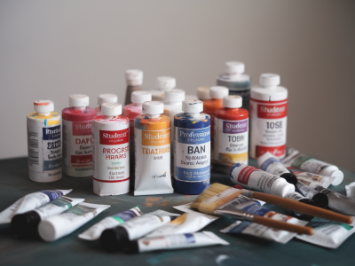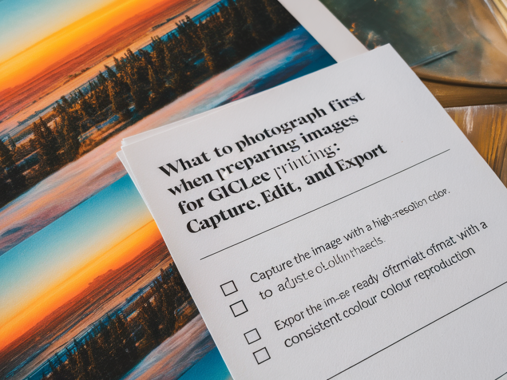
When I prepare images of my paintings and mixed-media pieces for giclée printing, I try to think like both the maker and the reproducer. I want the texture, colour relationships and subtle marks to survive the translation from studio surface to archival print. Over the years I’ve developed a practical checklist that starts in the studio and ends with an exported file that a print lab can trust. Below I share the steps I take — from capture to export — so you can get consistent, accurate results without guessing.
Studio setup: light, camera, surface
I always begin by making the environment predictable. Natural light can be beautiful, but it’s variable. For consistent colour I prefer continuous, daylight-balanced LED panels (around 5000–5500K) or two matched softboxes positioned at 45-degree angles to the artwork. This reduces hotspots and preserves surface detail.
- Mount the artwork flat: For paintings on board or paper, clamp or tape them to a rigid backing so they sit perfectly flat. For canvases, I photograph them face-on with the stretcher edges parallel to the frame of the image.
- Use a tripod: A sturdy tripod keeps your camera perfectly level and allows me to shoot at lower ISOs for cleaner files.
- Avoid mixed light: Turn off windows and mixed indoor lights — even a small tungsten lamp will change skin tones and paper colours.
- Colour target: I include a small colour target or grey card in the frame for every shoot. X-Rite ColorChecker or small grey/white cards are a great reference for white balance and colour correction.
Camera and capture settings
I capture everything in RAW. That single choice gives me the maximum latitude in post-production for exposure and white balance corrections. If you have a mirrorless or DSLR, use a fixed focal length lens to reduce distortion — a 50mm or 85mm equivalent is a good starting point for flat artwork.
- ISO: Keep it as low as possible (100–200) to minimise noise.
- Aperture: Choose a mid-range aperture (f/5.6–f/8) to maximise edge-to-edge sharpness.
- Shutter speed: Use a shutter release cable or the camera’s timer to avoid shake.
- Focus: Manually focus on a detailed area of the work, then switch to live view and zoom in to ensure tack-sharp capture.
- Bracket exposures: For complex surfaces or glossy varnish, take a couple of exposures (+/- 1 stop) so you can blend highlights later if needed.
Framing and scale
Frame the artwork tightly but leave a little border for cropping later. I also photograph a detail crop (close-up) to show texture — this is useful for the printer if they need to check ink lay and texture interpretation. If you’re photographing a large work that won’t fit in one shot, plan for overlap and shoot with consistent exposure so you can stitch accurately in post.
Editing workflow: raw conversion to proof
My go-to tools are Adobe Camera Raw or Lightroom Classic for primary corrections, then Photoshop for any spot repairs, stitching or advanced colour management. If you prefer Capture One, that works equally well — the principles are the same.
- Start with the colour target: Use the colour card in the image to set precise white balance and exposure. In Lightroom/ACR I use the eyedropper on the neutral grey patch to remove colour cast.
- Adjust exposure and contrast: Aim to match the tonal range you see in the studio — not an overly contrasty look unless that’s part of the work.
- Correct lens distortion: Apply lens correction and crop to the artwork edges so the image is rectangular and the perspective is true. For front-on shots this should be minimal.
- Retouch carefully: Use the spot healing brush to remove dust, lint or tiny reflections. I avoid heavy cloning; I want the surface to remain honest.
- Sharpening: Do only basic sharpening for the file you’ll send to the printer. Final output sharpening is best applied according to the printer’s specs and the final print size.
Colour management and soft proofing
Consistent colour reproduction depends on colour-managed files. I work in a wide gamut working space like ProPhoto RGB while editing, then use soft proofing to check how the image will look in the printer’s profile (often an ICC profile provided by the lab).
- Assign vs convert: Make sure your working file has a proper RGB profile assigned (ProPhoto or Adobe RGB). Don’t leave it untagged.
- Soft proof: In Photoshop or Lightroom use the printer’s ICC profile to soft proof. Look for gamut warnings (out-of-gamut colours) and adjust saturation/tone to bring important colours into printable range if necessary.
- Communicate with your lab: Ask for their preferred working colour space and whether they want files supplied in the printer profile or with an embedded generic profile.
Resolution, file format and export checklist
I keep a tidy, repeatable export checklist to avoid last-minute surprises. Giclée printers usually request 300 ppi at final print size as a guideline, but some labs can work with lower ppi depending on viewing distance.
| Final resolution | 300 ppi at full intended print dimensions (e.g., 300 ppi for a 24 x 18 inch print = 7200 x 5400 pixels) |
| File format | TIFF, uncompressed or ZIP-compressed if available. TIFF preserves layers if needed, but many labs prefer flattened TIFFs. |
| Colour profile | Embed the profile the lab requests (often the printer’s ICC profile or Adobe RGB/ProPhoto if they prefer conversion themselves). |
| Bit depth | 16-bit where possible — retains smoother tonal gradations. |
| Sharpening | Apply light output sharpening if you cannot rely on the lab to do it; otherwise leave sharpening to them and note this in your order. |
| File naming | Use descriptive, consistent names (e.g., ArtistTitle_Size_300ppi_Date.tiff) |
Communicate with your printer
I always send a low-resolution PDF or JPEG proof along with the high-res TIFF and include notes: paper choice (e.g., Hahnemühle Photo Rag 308gsm), finish (matte/satin), intended viewing distance, and whether the colours of the reproduction must match a specific area (skin tone, a particular blue). Ask the lab for a hard-proof or a colour-accurate test print if colour-critical work is involved — it’s a small cost that saves frustration.
Final practical tips
- Keep originals backed up: Archive both RAW and final TIFF copies in at least two locations.
- Detail shots: Include close-ups at the same resolution so the printer understands texture.
- Version control: If you make colour edits after receiving a proof, increment the version number in the filename (v01, v02).
- Test prints: For new papers or unusual colours, order a small test print (A4) to check gamut and paper response before a full run.
Photographing for giclée is part technical discipline, part translation. The more you standardise your capture and file-prep routine, the more consistent your results will be. And when in doubt, send clear instructions to the print house — many technicians are happy to advise on profiles, paper choices and sharpening. Having worked with different labs, I can say that clear files plus good communication equals prints that feel faithful to the original.