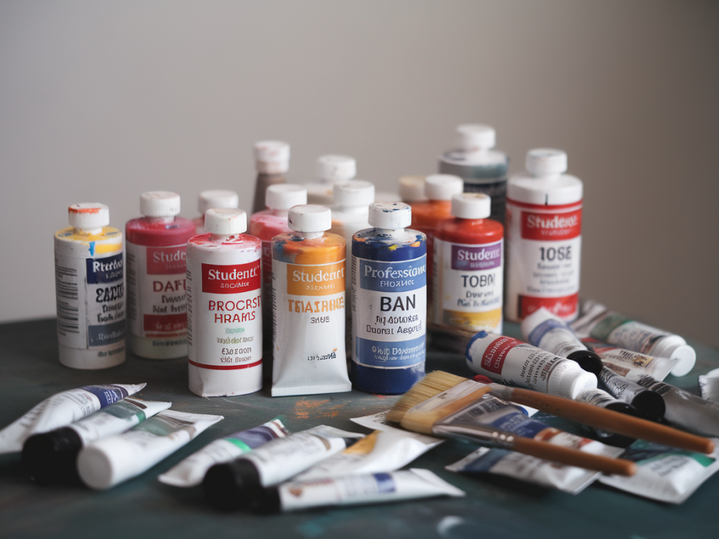
I remember the moment I debated swapping my familiar student tubes for a row of glossy pro bottles: standing in the art-supply shop, squeezing colour onto a scrap of primed board, watching how a cadmium-equivalent flattened out differently depending on which tube I’d purchased the week before. It felt like a small rite of passage — but also an investment decision. When, exactly, should a maker step up from student acrylics to professional-grade paints? The answer isn’t purely financial or purely aesthetic; it’s practical, and a little bit personal. Below I’ve pulled together a cost-and-performance checklist that has helped me — and many artists I’ve worked with — decide whether it’s time to upgrade.
Why the distinction matters
Student acrylics are formulated to be affordable and forgiving: they often have less pigment, a higher ratio of filler or extender, and binders that keep costs down. Professional acrylics typically contain more pigment, cleaner and stronger colour, better lightfastness ratings, and higher-quality acrylic polymer binders. That translates to richer, more reliable colour, better handling and longevity — but also higher price.
Upgrading is not about prestige; it’s about whether the paint's performance affects your process or outcomes. If you’re experimenting, learning colour mixing or practising composition, student paint might be fine. If your work depends on subtle chromatic shifts, long-term durability, or you’re preparing pieces for sale and exhibition, pro paints start to look essential.
Key performance factors to test (and how I test them)
Before I buy a full set, I test paints in small quantities. I make a simple swatch card with the following checks:
These simple tests, done across a handful of colours (primary red, yellow, blue, black and white, and a couple of favoured pigments like phthalo or quinacridone), reveal a lot about whether a professional range will noticeably change my results.
Cost vs performance checklist
Below is a practical checklist I use to weigh cost against performance when comparing student and professional acrylics.
| Question | What to look for | Why it matters |
|---|---|---|
| How often do you paint? | Occasional vs daily | Frequent makers justify higher upfront costs through better coverage and less waste. |
| Are you selling or exhibiting? | Hobby vs commercial | Pro paints have documented permanence—important for collectors and galleries. |
| Do you rely on specific pigments? | Unique hues or mixes | Professional ranges have stronger, purer pigments and fewer fillers, so mixes are more predictable. |
| How important is drying time? | Fast vs open time | Some pro acrylics (e.g. Golden OPEN) offer longer working time, which can be essential for glazing and blending. |
| Do you use heavy impasto or thin washes? | Texture needs | Pro paints can support thicker layers without cracking and often have higher pigment load for glazing. |
| Budget per painting | Calculate expected material cost | Estimate whether the price increase per piece is sustainable for your practice. |
Brands and ranges I’ve found useful (and why)
I’m wary of recommending “the best” brand outright — preferences depend on technique — but here are a few ranges I test against for different needs:
For student ranges, brands like Reeves, Daler-Rowney System 3 (student), and Liquitex Basics are honest about being budget options. They have their place: bright, useful, and forgiving—perfect for studies and practice works.
Practical buying tips to reduce waste and cost
Red flags that suggest you need to upgrade
Stepping up from student to professional acrylics isn’t a single “right” moment. Treat it like an experiment: test a few tubes, observe how they change your practice, and prioritise the pigments and qualities that matter most to your work. For many makers, a hybrid approach — mixing a few professional pigments into a primarily student palette — gives the best balance of cost and performance while preserving the freedom to explore.