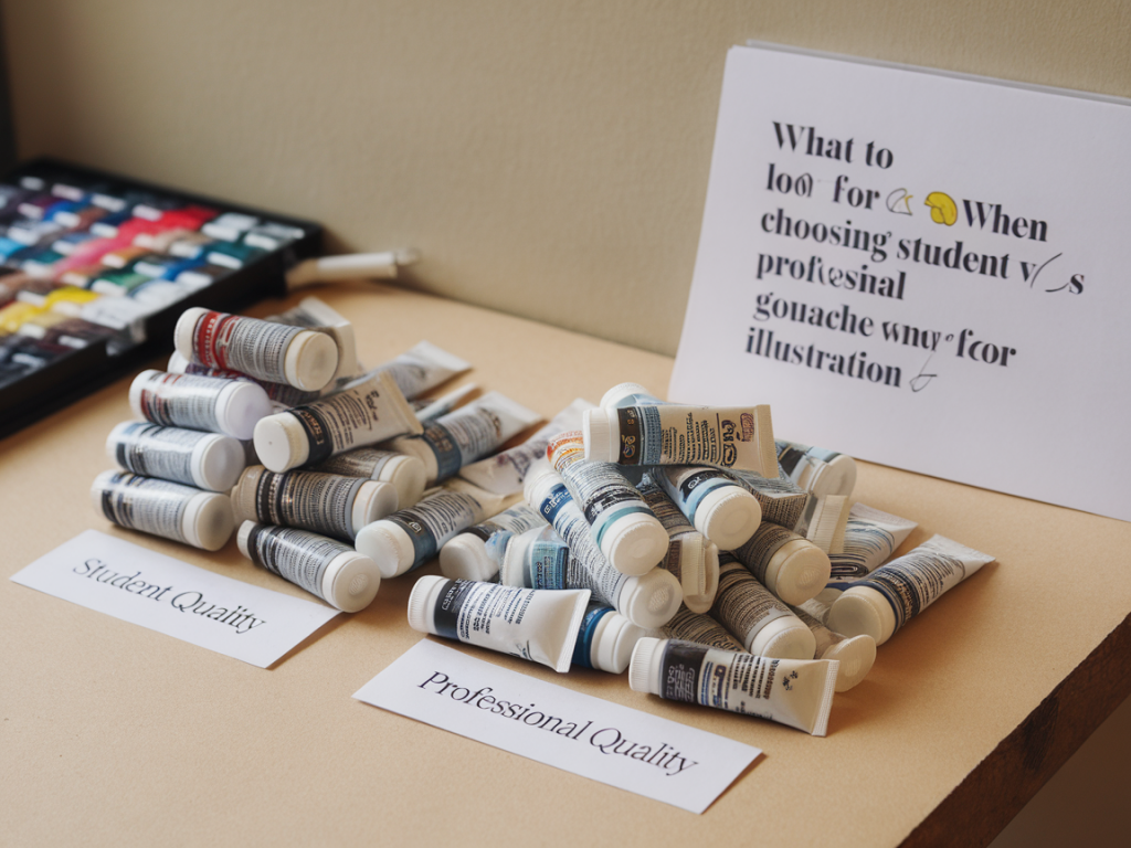
I often get asked whether student or professional gouache is the better choice for illustration work. It’s a practical question with no single correct answer — it depends on your goals, budget and the life you expect your work to lead. Over the years I’ve used both types extensively, teaching students and producing finished pieces for publication, so here I’m sharing what I look for when choosing gouache and how I decide which grade to use.
What I mean by “student” vs “professional” gouache
When I say student gouache I mean the paints marketed as entry-level: lower pigment concentration, more filler, often less permanent. Professional or artist-grade gouache usually has higher pigment load, better lightfastness ratings and clearer labelling of pigments. That said, some mid-range brands sit in-between, and a few student ranges punch above their weight for certain colours.
Key factors I check before buying
There are a few practical attributes I always evaluate. These determine whether a tube will survive my studio tests and—crucially—how well the work will reproduce for print or digital uses.
- Pigment concentration and tinting strength: Professional gouache will cover more cheaply and mix more cleanly. When I’m illustrating, I want reliable tinting strength so my mixes aren’t diluted by fillers that make colours look muddy.
- Lightfastness/permanence: If the illustration will be used commercially or held in a collection, lightfastness matters. Many student colours lack reliable permanence. I look for ASTM or Blue Wool ratings on the tube, or detailed pigment information (e.g., PB15:3) so I can check permanence.
- Opacity and hiding power: Gouache’s opacity is one of its charms. Professional gouache tends to have stronger opacity where needed. However, there are brilliant transparent pigments in pro ranges too — they’re just labelled as such.
- Rewetting and working time: Gouache reactivates with water. A consistent rewetting behaviour helps when I want to lift, glaze or retouch. Some student paints become chalky when rehardened; pro brands usually rewet smoothly.
- Drying shift: Gouache often dries slightly darker or flatter. Pro brands usually have less unpredictable shift. When I’m matching a colour to a client brief or print sample, that predictability is essential.
- Surface finish and texture: Do I want a matte, velvety finish or something that accepts drawing on top (ink, pencil, gel pen)? Professional gouache often gives a superior matte finish that takes subsequent mark-making well.
- Packaging and convenience: Pans vs tubes can affect studio workflow. I prefer tubes for colour control and mixing, but pan sets are handy for plein air or travel.
How the intended use changes my choice
When I’m teaching a one-day workshop, cost and accessibility matter. Student gouache is usually fine for exploration, mark-making exercises and learning colour mixing. But when I’m producing work for a client or preparing pieces for reproduction, I reach for professional gouache for its consistency and archive properties.
- Sketches, classwork, experiments: student gouache (e.g., Winsor & Newton Cotman, Daler-Rowney FW student ranges). It’s forgiving, cheaper and good for quick studies.
- Client commissions, editorial illustration, prints and gallery pieces: professional gouache (e.g., Winsor & Newton Designers’ Gouache, Holbein Artists’ Gouache, M. Graham, Schmincke). These give me predictable mixes, better permanence and more consistent scanning results.
- Mixed-media work where I combine acrylic or collage: sometimes I use professional gouache because it integrates better with acrylic layers and doesn’t rewet unpredictably when later varnished or fixed.
Practical tests I run before committing to a new brand
Before I start a big project with a new range I do a short battery of studio tests. I’ve found a five-minute chart saves hours of frustration later.
- Colour swatches: straight from the tube, then thinned mixes. Look for granulation, transparency and drying shift.
- Rewetting test: let a swatch dry fully, then rewet with a damp brush to see if it lifts cleanly.
- Lightfastness check: if pigments are labelled, I cross-check with databases (e.g., the Pigment Database or manufacturers’ info).
- Layering and scumbling: test thin layers over dark/ light grounds to see opacity and whether the surface cakes.
- Ink and pencil overpaint: try adding ink lines and cold wax pencil marks on top to ensure the gouache accepts future marks.
Tips for scanning and reproduction
As an illustrator I think about reproduction from the outset. Gouache scans beautifully if prepared correctly. Here’s what I keep in mind:
- Use a heavyweight paper with a smooth surface (300gsm+), such as hot-pressed watercolor or Bristol board, to avoid unwanted texture in flat areas.
- Professional gouache with higher pigment load often scans truer to the painted colour; student paints can shift and lose vibrancy.
- Allow colors to dry fully before scanning; any sheen from moisture will create highlights or banding.
- Scan at 600 dpi for fine work, then do colour corrections in small increments. It’s easier to enhance a slightly dull scan than to fix one with pigment inconsistencies.
Cost versus value: a pragmatic view
Cost is a real consideration. Professional gouache is more expensive; a tube lasts longer because you need less pigment to achieve opacity. I weigh cost per effect: spending more on a reliably permanent, predictable red or blue can save time and rework later. For other colours (e.g., earth tones I use sparingly), student versions are often perfectly adequate.
| Characteristic | Student Gouache | Professional Gouache |
|---|---|---|
| Pigment load | Lower | Higher |
| Lightfastness | Variable | Better documented |
| Rewetting | Can be chalky | Usually reactivates cleanly |
| Cost | Lower upfront | Higher upfront, better coverage |
| Consistency | Less predictable | More consistent |
Brand notes from personal use
Some brands I return to: Holbein’s Artists’ Gouache has become a favorite for saturated, smooth mixes and great rewetting. Winsor & Newton Designers’ Gouache is a staple for illustration—consistent and widely available. M. Graham’s gouache, with its honey-based binder, keeps rewetting beautifully. On the student side, Daler-Rowney’s System3 or Cotman ranges are perfectly serviceable for studies and workshops.
Final practical checklist I use in my studio
- Will this piece need long-term colour permanence or reproduction? If yes: use professional.
- Am I experimenting, teaching or doing quick studies? Student gouache will keep costs down and maintain flow.
- Do I need a particular pigment (e.g., PR122 Quinacridone Red)? Check pigment codes and lightfastness before buying.
- Test rewetting and layer behaviour on the paper you’ll use for the final work.
- Consider tube size and packaging: larger tubes are often more economical; pans are handy for location work.
Choosing between student and professional gouache is less about a rigid hierarchy and more about matching the paint to the project. Both have their place in my practice: student gouache for playful exploration and learning, professional gouache for work that needs to last or be reproduced reliably. When in doubt, I test — a small colour chart and a quick layer test tell me more than a label ever will.