I often return to glazing with acrylics when I want colour depth that feels almost like light passing through layers — that luminous, jewel-like effect you associate with oil glazes, but achieved with acrylics’ faster drying time and versatility. Over the years I’ve developed a step-by-step approach that balances control and serendipity. Here I’ll walk you through my process on a prepared canvas, from surface preparation to the final glaze, and answer common questions I hear in my workshops.
Why glaze with acrylics?
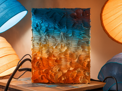
Glazing is about building thin, transparent layers so light travels into the paint, bounces off lower layers, and returns to your eye having mixed optically rather than physically. With acrylics you get faster curing, less tack, and options for modern mediums that maintain clarity. I use glazing when I want subtle shifts in hue, richer shadows, or a sense of atmosphere that can’t be achieved with opaque paint alone.
Materials I reach for
I recommend testing materials because brands and formulations behave differently. Below is a quick reference of what I typically use in studio:
| Item | Purpose / Notes |
|---|---|
| Prepared canvas (gessoed) | Smooth or toothy depending on desired texture. I sometimes seal with an acrylic primer like Golden or Liquitex. |
| Acrylic paints | Artist-grade for strongest pigments. I use Golden Heavy Body and Liquitex Soft Body depending on flow needs. |
| Glazing medium | Gloss or satin acrylic glazing medium (Golden GAC 100 or Liquitex Glazing Medium). Looks clearer than mixing with water. |
| Retarder | Optional — slows drying for blending (Liquitex or Golden Retarder). |
| Brushes | Soft synthetic flats and filberts for smooth, even layers; a fan brush for feathers. |
| Palette knife & palette | For mixing thin glazes, and for scraping back layers if needed. |
| Mist spray bottle | To lightly re-wet palette colour or reduce skinning. |
| Varnish | Final protective coat, choose gloss to enhance depth. |
Preparing the canvas
I start with a canvas that’s been primed with two thin coats of acrylic gesso. If I want an ultra-smooth ground for glazing, I sand lightly between coats with a fine (220–320) abrasive. For a bit more tooth, I stop after two coats without sanding. Next I apply a very thin, evenly toned underpaint — often a mid-value neutral (e.g., raw umber mixed with a little titanium white) or a warm terra cotta. This initial tone helps the glazes sing and gives a consistent surface so the first transparent layers read as luminous rather than patchy.
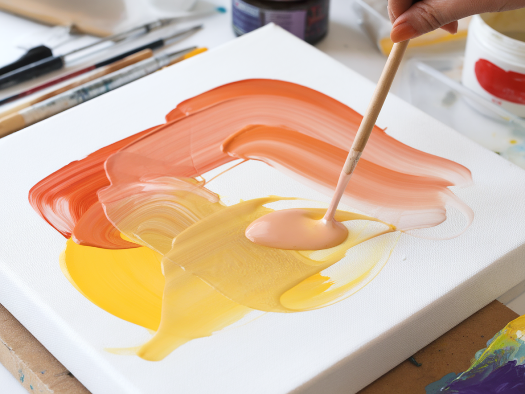
Mixing glazes: recipes and ratios
A glaze is essentially pigment + transparent binder. Avoid using too much pigment — the goal is transparency. A typical starting mix is:
For example, mix a pea-sized dot of phthalo blue with 5 times that volume of glazing medium. If it dries cloudy, you had too much pigment or an incompatible medium — switch to a clearer glazing medium or thin further. Keep a spare tile or palette card to test your glazes against the underpaint.
Step-by-step glazing process
Below is the practical sequence I follow in the studio. I tend to work from general to specific and alternate warm and cool layers for vibrancy.
Common problems and fixes
Some issues come up repeatedly in demos — here are straightforward remedies I use.
Techniques I like to combine with glazing
Glazing is one tool in my toolkit and I often pair it with:
How long does glazing take?
That depends on the scale and number of layers. A small panel with three thin glazes might be done in a day. Larger works with many glazes can take weeks, with drying time between layers guiding the schedule. I treat glazing as both a technical and meditative process — patience usually pays off in visual depth.
Tips for testing and staying consistent
Always keep a test strip or a ‘glaze map’ for each painting: label mixes, note ratios and drying behaviour. This saves time when you want to replicate a particular glow. Photograph layers in good light as you work — sometimes the camera reveals subtle shifts you miss in person.
Glazing with acrylics is wonderfully adaptable: you can be meticulous or allow chance to play a part. Experiment with small squares of different pigments over the same underpaint tone and you’ll quickly see which combinations give you that luminous, inner light. If you’d like, I can share a printable glaze test chart you can use in your studio.