I love the tactile, layered quality of textured paintings. Capturing that texture for social media can feel frustrating—flat phone photos that don't show depth, harsh shadows that swallow subtle glazes, or blown-out highlights that erase impasto. Over the years I've developed several straightforward approaches that work without a light tent, using things most of us already have: window light, reflectors, simple flashes, phone accessories and a couple of gentle post-processing habits. Here are five ways I regularly use to photograph textured paintings so the surface reads clearly online while still feeling true to the work.
Work with side light from a window
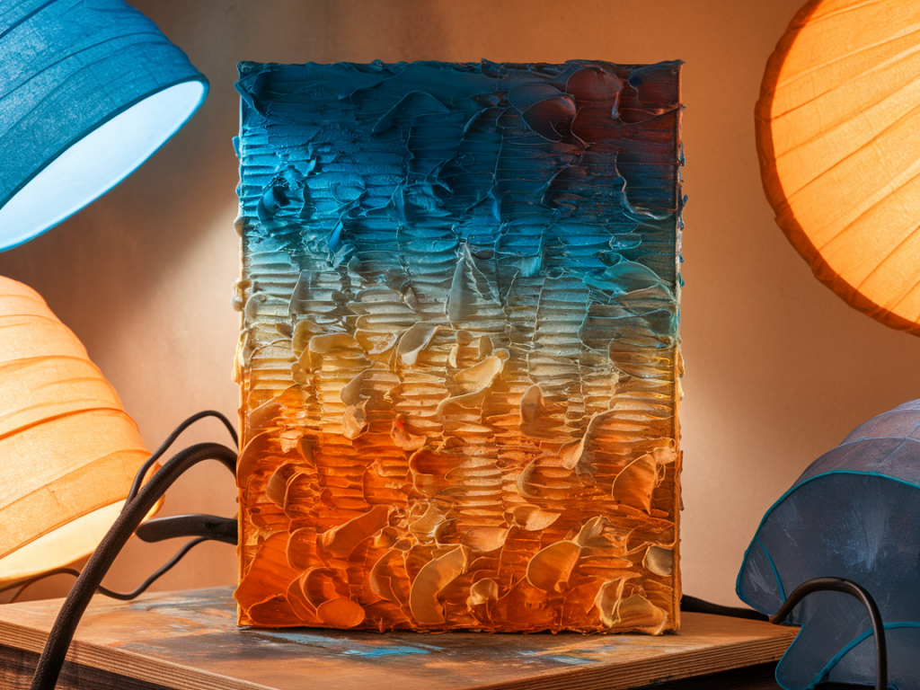
Natural light is my go-to. A north-facing window is perfect because it gives soft, cool, even light throughout the day. I position the painting so the window light hits it from the side at about 30–45 degrees. This accentuates texture without harsh shadows—impasto, brush marks and collage edges throw small, readable shadows that reveal depth.
Two practical tips:
For camera settings I usually use a tripod and shoot in RAW. On a mirrorless camera I aim for a low ISO (100–200), an aperture around f/8–f/11 for edge-to-edge sharpness, and adjust shutter speed accordingly. With a phone, lock exposure (tap-and-hold on iPhone) and gently lower exposure if highlights are threatening to clip.
Use a cheap reflector to balance shadow
Side light can be dramatic, but sometimes the shadow side becomes too deep. A small reflector placed opposite the window returns light into the shadow areas and keeps texture readable without flattening the surface. White foam core, silver car sunshades, or even a sheet of white paper do the job.
How I set it up:
This is especially helpful when photographing textured works with deep grooves or heavy collage. The reflector unwraps those dark crevices so they read online.
Low-oblique flash or off-camera flash for crisp texture
If you have a small speedlight or a portable LED panel, directional flash can produce beautiful, crisp texture. The key is to place the light low and at an acute angle—almost grazing the surface. That grazing light creates long, revealing shadows that emphasise relief.
Settings and practicalities:
This method is fast and reproducible. I often use it when I need consistent results for a series of works or when shooting in the evening. A remote trigger and tripod make life easier.
Make small rigs for close-ups and scale shots
Showing both detail and scale is important for social media. People want to see the surface intimately but also understand the painting's size. I make two simple rigs that work without fancy equipment:
When doing close-ups I pay attention to depth of field. A narrower aperture gives more of the surface in focus; if you want a shallow depth of field to isolate a texture patch, open up the aperture but be cautious—the fall-off can make parts of the texture unreadable.
Capture texture with short video or cinemagraphs
Sometimes a still image can't fully communicate surface qualities. Short video clips—5–10 seconds of a slow pan or a 3–4 second rack focus—can show how light plays across a textured surface in a way that feels immediate and tactile. Cinemagraphs (a mostly still image with a small looping motion) are another elegant option, for example a subtle shimmer of varnish or a brush-flick in the background.
How I make brief texture videos:
Quick editing tips to preserve texture
Post-processing should enhance, not invent. My edit workflow focuses on clarity and faithful colour:
Finally, remember framing and orientation for social platforms: vertical images occupy more feed real estate, but square crops are safe. I usually upload a vertical crop and include a landscape detail as a second image in the carousel to show context.
These five approaches—window side light, reflectors, grazing flash, simple rigs, and short video—are interchangeable and scalable. I mix them depending on the painting, the studio setup and how much time I have. None require a light tent, and all aim to communicate the physicality of the work honestly. If you'd like, I can walk through a live example with a painting you have in mind and suggest a setup tailored to its surface and colour palette.