I like to think of a colour recipe library as a toolbox that travels with me from one project to the next. Over the years I’ve developed a system that helps me recreate consistent palettes—whether I’m working on a series of small gouache studies, a mixed-media commission, or translating a palette into digital illustrations. The trick isn’t just in mixing the right hues; it’s in documenting them in a way that’s repeatable, searchable and adaptable. Below I share the workflow I use in my studio to build a colour recipe library that actually gets used.
Why a colour recipe library matters
Consistency is rarely accidental. If you want the same warm teal or dusty rose to appear across several works, you need more than memory. A good library saves time, reduces waste, and keeps your work visually coherent. It also makes teaching and writing about colour easier—I can share exact recipes in workshops and in tutorials on Sonriseartists without leaving learners guessing.
Decide the scope and format
First, decide what you’re documenting. Is this for a single project, a seasonal palette, or a lifetime of go-to mixes? I maintain three tiers:
- Project recipes — highly specific mixes used within a body of work.
- Core recipes — my everyday go-tos across media (a muted skin tone, a deep neutral, a classic warm yellow).
- Experiment recipes — playful combinations, one-offs and accidents worth keeping.
Format-wise, I keep dual records: analog (swatch cards and a physical notebook) and digital (a spreadsheet + organised image folder). Each has advantages: the physical card shows real-world behaviour of the paint, while digital records are searchable and easily shared.
What to record for each recipe
Consistency comes from capturing context. Here’s the information I record for every recipe:
- Recipe name — a memorable label, e.g., “Muted Lake” or “Warm Neutral B.”
- Media — gouache, acrylic, oil, ink, mixed-media grounds, etc.
- Brand and series — pigment behaviour varies by manufacturer (Winsor & Newton, Schmincke, Golden, Holbein, etc.).
- Components and ratios — list paints and approximate mixing ratios (e.g., 2:1 Ultramarine Blue to Yellow Ochre + a touch of Burnt Umber).
- Opacity and tinting strength — opaque/transparent and how strong it tints white/medium.
- Binder and medium — for oils/acrylics, note mediums used (linseed, acrylic gel), and for inks note dilution.
- Surface and preparation — paper type, gessoed board, primed canvas, etc.
- Lightfastness / permanence — useful for commissions and archival work.
- Visual swatch — opaque swatch, washed/transparent swatch, and a graded tint bar to show behaviour across values.
- Date and project tags — for searching later.
Practical recipe template (table)
| Field | Example entry |
|---|---|
| Recipe name | Muted Lake |
| Media | Gouache |
| Brand / Pigments | Schmincke Horadam Ultramarine (PB29), Winsor & Newton Yellow Ochre (PY43), Burnt Umber (PBr7) |
| Mix ratio | Ultramarine 2 : Yellow Ochre 1 + tiny Burnt Umber |
| Opacity | Semi-opaque |
| Surface | 300gsm cold-pressed paper, primed board |
| Lightfastness | Good |
| Swatches | Attached photo + physical swatch card |
| Notes | Dries slightly duller than wet; add small amount of gouache white for warmer midtones |
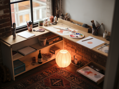
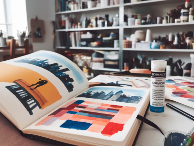
Making and storing physical swatches
I make swatch cards on heavy paper or illustration board. Each card shows:
- a solid, full-strength patch;
- a graduated tint bar (mixing the colour with white or water in steps);
- a line to test granulation or brush behaviour;
- a small label with the recipe metadata.
Keep cards in archival sleeves or index boxes. I organise mine by hue family (Blues, Greens, Neutrals) and add project-specific tabs. Physically flipping through the cards is a fast way to choose a palette in the studio.
Creating digital records and palettes
Photograph swatches in consistent light—indirect daylight or a lightbox—and include a small neutral grey card in the frame for colour correction. I store images in folders named by hue and recipe name. A simple spreadsheet (Google Sheets or Excel) works brilliantly as an index: each row is a recipe and I include links to the swatch images.
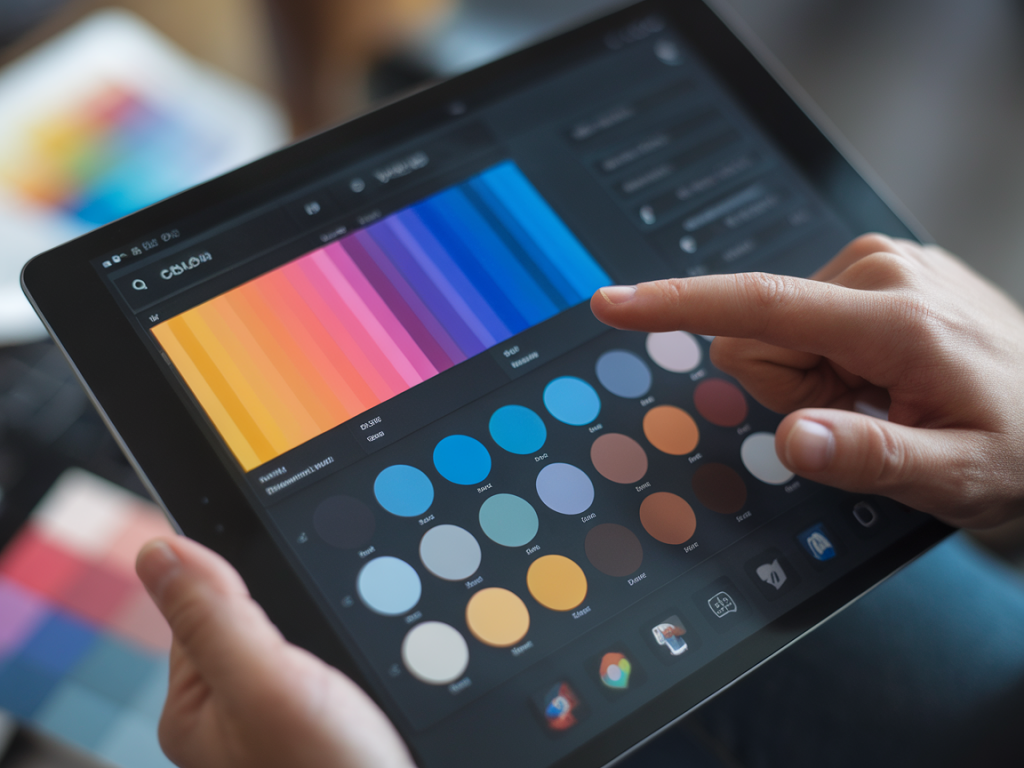
For designers or when I need precise digital equivalents, I sample the photographed swatch in Photoshop or Affinity Photo to extract RGB/HEX values—bearing in mind that screen colour will never perfectly match pigment. I keep both the photographed JPEG and a vector swatch saved as an SVG for reuse in digital mockups.
Recording ratios that actually work
Mixing ratios can be deceptively vague. I prefer using simple volume measures: drops from a pipette or dollops measured on a palette knife. Write ratios as whole numbers rather than percentages—for instance, 2:1 instead of “66%” — it’s easier to scale up. If a colour needs “a touch” of another pigment, quantify it: 2:1:1/8, or “two parts A, one part B, a quarter of a part C”.
Tagging and searching your library
Tags make the library useful. I tag recipes with terms like “cool muted”, “high tinting”, “skin tone”, “deep neutral”, “background wash”, and by media. In my spreadsheet I use filters so I can quickly find, for example, all gouache recipes tagged “muted” and “cool”.
How I use recipes in practice
When I start a new piece, I pull three-to-five recipes: a dominant colour, a supporting neutral, and an accent. I mix enough at the outset and keep small labeled jars or airtight palettes for continuing sessions. If something behaves oddly (dries chalky, layers poorly), I update the recipe notes—these notes save me repeated experiments later.
Tips for portability and sharing
- Keep a pocket notebook with 8–10 “favourite recipes” written in a compact form for plein-air work.
- Export colour palette images and a CSV of your spreadsheet when collaborating or selling colour-consistent prints.
- Back up digital records to cloud storage (I use Google Drive + a local SSD) and keep scans of physical swatches.
Building a useful colour recipe library takes a little time up front but it becomes one of those studio investments that pays off again and again. It keeps your work recognisably yours, speeds up decision-making, and gives you the freedom to experiment without losing track of the colours you love. If you’d like, I can share a downloadable spreadsheet template or a printable swatch-card layout next—just tell me what media you use most.