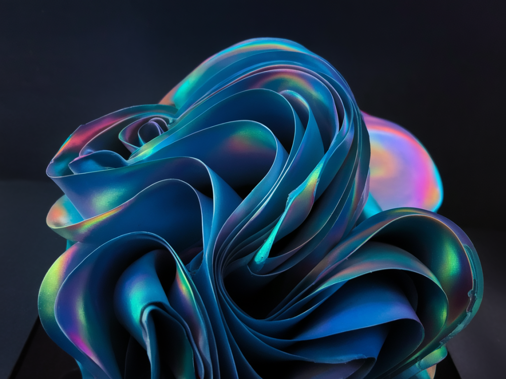
I love iridescent and interference paints for the way they shift — a colour that seems to breathe as you move. Photographing them with a phone can feel impossible at first: the camera often flattens the shimmer or misreads the colour, and you end up with a dull patch where the surface had life. Over years of testing in my studio, I’ve found simple lighting and exposure tricks that help capture that dynamic, pearlescent quality using only a phone. Here’s a hands-on guide you can try today.
Why iridescent paints are tricky
Iridescent and interference paints rely on thin-film optics and light angle to create colour shifts. That means the appearance changes with subtle variations in angle, light intensity and spectral content. Phone sensors and automatic software are designed to average things out for a pleasing result — which often removes the very effect you want to show. So the goal is not to trick the phone but to work with it: control the light, control the angle, and take multiple exposures.
What I use in the studio (phone-friendly kit)
You don’t need professional flash or a DSLR. Here are items I keep by my easel that make a big difference when shooting with a phone:
Phone: Any recent smartphone with RAW capability (iPhone 11/12/13/14/15, Pixel 4/5/6/7, Samsung S20 onward). RAW gives you more recovery in post.Tripod & phone clamp: A small tripod stabilises the frame so you can make micro-adjustments without blur. I use a simple Joby or Manfrotto clamp.Polarising filter for phone: A screw-on or clip-on polariser (Moment, PolarPro) helps control glare, though use it sparingly — sometimes you want the sheen.Small LED panels: Continuous LED panels with adjustable colour temp (e.g. Neewer, Aputure Amaran) are brilliant. They’re predictable and consistent.Reflectors & diffusers: A white foamboard as a reflector and a small diffuser (silk or tracing paper) soften harsh highlights and increase the range of visible iridescence.Black & neutral backgrounds: I keep black velvet and mid-grey boards to test how the interference pigments pop against different contrasts.Setting up: angle and background
The single most important thing is angle. Iridescence often appears strongest at oblique viewing angles; photographing head-on can flatten it. I’ll often position the camera so the plane of the paint sits at about 20–40° to the lens. This may feel awkward, but it reveals depth and the colour shift.
Background matters too. Dark backgrounds make highlights pop and increase perceived saturation, while mid-grey shows a more neutral balance. Black velvet is my go-to when I want dramatic shimmer; a neutral grey card helps when I plan to edit for accurate colour later.
Lighting approaches that work
There are a few lighting set-ups I cycle through depending on the effect I’m after. Try each and see which reflects your paint best.
Single directional light, low angle: Place an LED panel low and to one side so the light grazes the surface. This emphasises texture and brings out the layered sheen.Two-light cross-light: Two panels at roughly 45° from the surface on opposite sides create a complex mix of reflections and can show multiple colour shifts simultaneously. Reduce intensity if highlights blow out.Soft diffused light with a reflector: Diffuse a light through tracing paper and add a white reflector opposite. This softens glare and helps reveal subtle pearlescent transitions rather than stark specular highlights.Backlight + front fill: Put a light behind the piece (out of frame) and a soft fill in front. The backlight accentuates thin-film effects while the frontal fill keeps the rest of the painting visible.Phone camera settings: manual where possible
I always switch to a camera app that offers manual controls (Native Camera Pro mode, Adobe Lightroom Mobile, Halide). Auto mode may push exposure and white balance in ways that crush iridescence.
Shoot RAW: RAW preserves highlight and colour data, giving you more room to bring out shifts in editing.Lock focus and exposure: Tap to focus on the iridescent area and then, if your app allows, lock exposure (AE/AF lock). Small exposure adjustments can make or break the shimmer.Use exposure compensation: If your phone lacks manual shutter/ISO, use exposure compensation to slightly underexpose (-0.3 to -1 EV). Underexposing preserves specular highlights and prevents them from clipping to white.ISO & shutter: Keep ISO as low as possible (under 400) to reduce noise, and adjust shutter speed using a tripod. Faster speeds freeze micro-reflections; slower speeds can blow out detail if the light is bright.White balance: Set a custom white balance or use a neutral grey card. Iridescent pigments reflect different wavelengths at different angles; an automatic WB can shift hue unpredictably.Practical step-by-step shoot I use
Here’s a step-by-step sequence I follow when documenting a small panel or sample:
Mount the phone on a tripod and set the panel at 20–40° to the lens.Choose a background (black for drama, grey for accuracy).Set a single LED panel at low-angle grazing position. Start at 25% intensity.Open your manual camera app, switch to RAW, set ISO 100–200, tap to focus, and lock AE/AF.Take a bracketed series: normal exposure, -0.7 EV, +0.7 EV. Move the light slightly between shots (a few centimetres) to see how the sheen shifts.If you have a polariser, shoot one set with and one without. The polariser can reduce distracting reflections but may also remove desirable pearlescence — compare both.Editing tips: make the shimmer sing
In editing (I use Lightroom Mobile or desktop), work on RAW files and be subtle. Over-saturated or over-clarified images become fake looking quickly.
Recover highlights: Pull highlights down to bring back specular detail. This can reveal rainbow-like interference that was blown out in camera.Boost texture selectively: Use the texture or clarity sliders sparingly on the iridescent area to emphasise microstructure without adding halo artefacts.Selective colour: If the shift is primarily in blue/green/pink bands, use HSL adjustments to selectively increase luminance or saturation of those hues rather than touching global saturation.Dehaze and contrast: A small dehaze increase can make colours pop, but watch for crushing shadows. Contrast helps separate the sheen from the base colour.Local brushes: Paint in exposure or highlight recovery exactly where specular highlights are clipping. This nuanced control brings out the layered look.Quick reference table: starting camera settings
| Lighting condition | ISO | Shutter | Exposure comp |
| Bright LED grazing | 100 | 1/125–1/250 | -0.7 |
| Soft diffused light | 100–200 | 1/60–1/125 | 0 to -0.3 |
| Dim studio / backlit | 200–400 | 1/30–1/60 (tripod) | -0.3 to +0.3 |
Common mistakes I tell students to avoid
Relying solely on auto white balance — it often neutralises the iridescence you want.Using too much polarisation without checking results — you can accidentally remove the effect.Shooting only one angle — the magic of interference pigments lives in movement and variety.Over-editing global saturation — selective adjustments look more believable.Photographing iridescent and interference paints with a phone is part technical, part experimentation. I usually end up with a set of images that together communicate the effect: a close-up showing micro-reflection, a mid-shot showing the overall shift, and a detail with polariser on/off. Try the different lighting setups, bracket exposures, and keep notes on what worked for each pigment — after a few sessions you’ll find the few moves that consistently show the paint at its most alive.